

A CASE FOR SIMPLIFICATION
How to PUT FOCUS Back Into YOUR WORK

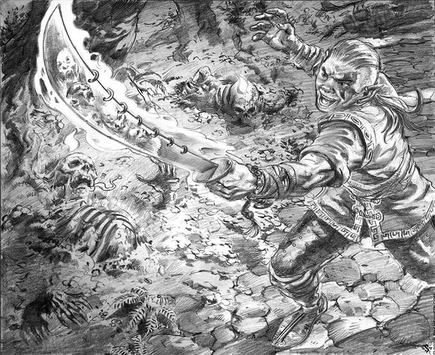
Or how to find a fall-back position when you become OVER-AMBITIOUS. 😊
I started out with this goal of illustrating 9 "Magic the Gathering" cards for my portfolio. I've never illustrated for Magic but I figured a theme such as that would help me focus my efforts.
Knowing very little about the world of Magic I called upon a friend who's been in it since the beginning to get his opinions on the concepts. This piece in particular I was calling Soul Blade. The idea was that it would attract the spirits of dead warriors to command. By the time I got down the color and lighting pass I realized something was already wrong.
Prefer a downloadable PDF? Get it here.
Not only were there too many ideas being presented for such a small card, but there were too many things vying for focus.
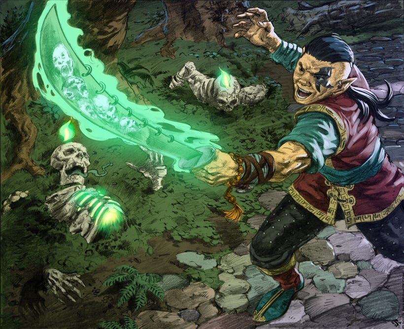
And yet, I pressed on, testing whether or not I could ride out the storm. At some point in your skillset, you may have the ability to back out of tough situations in the moment. It's a glorious thing if you can "make it work" based on a few adjustments here and there.
But when there are fundamental flaws, things you could have seen in the thumbnail and rough stage, if only you'd spent more time there, the heavy lifting may be too great when get to the finish. Such was the case for me. Now, perhaps a more skilled artist could have slowly backed away and reconfigured some lighting or simplified the ideas to make more sense.
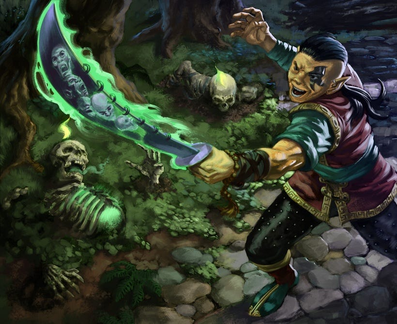
Because I was taking my time with the painting, I began to see that there was no way to make myself happy moving in the direction I had chosen. Let's take a look at what I saw and why it wasn't working.
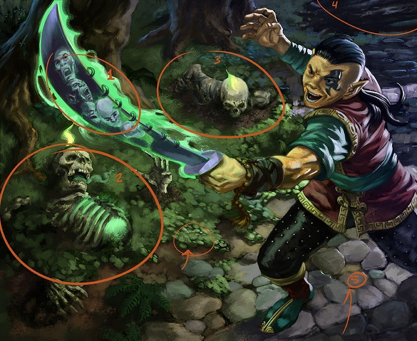
1. The idea of having tortured souls in the blade itself most likely will not read on the final card. It's essentially a wasted concept and a bit muddled.
2. The foreground skeleton has a lot going on. I wanted it to be rising from the forest floor with a similar powerful green glow emitting from its ribcage. This would indicate the connection to the sword. But then, there's a green breath escaping its mouth...what's that? I don't know, I thought it might look interesting as if it had a second breath of life. Then there was the flame on it's head. Kind of throwback to classical paintings of piety and guardianship of a higher power. All this within one character. Just too much going on.
3. The background skeleton was more along the lines of what I was looking for in terms of rising from the ground, but again, more going on, pulling focus away from the sword and competing with the lead character and the foreground. Especially when I would have to contend with the flame on its head. If there was no flame, then I could perhaps bury it in shadow, thus making seem even creepier. Then again, I was liking the rending of the skull.
4. Log. An element to keep the eye pushed into the scene. Follow the log in to the hand, the hand to the head, the eyes looking at the sword. It was a reinforcing element but also not essential. Our read is going to be left to right in Western culture. So, it should go sword, main characters eyes, raised hand with highest contrast and then.... wait what, the log creates tension around the head which holds our focus there but then there are these two skeletons I should check out.
5. Rendering. There is an aesthetic which I like in the art that I see but I, for whatever reason, cannot seem to create the same look for myself. So, I tend to over-render everything. As much as I like expressive brushstrokes, there is something in my brain that wrestles with how something should look. Maybe it's the draftsman in me always correcting between right and wrong. I don't know. Ultimately, I disliked the rocks, hated the foliage, and felt like the everything was falling apart.
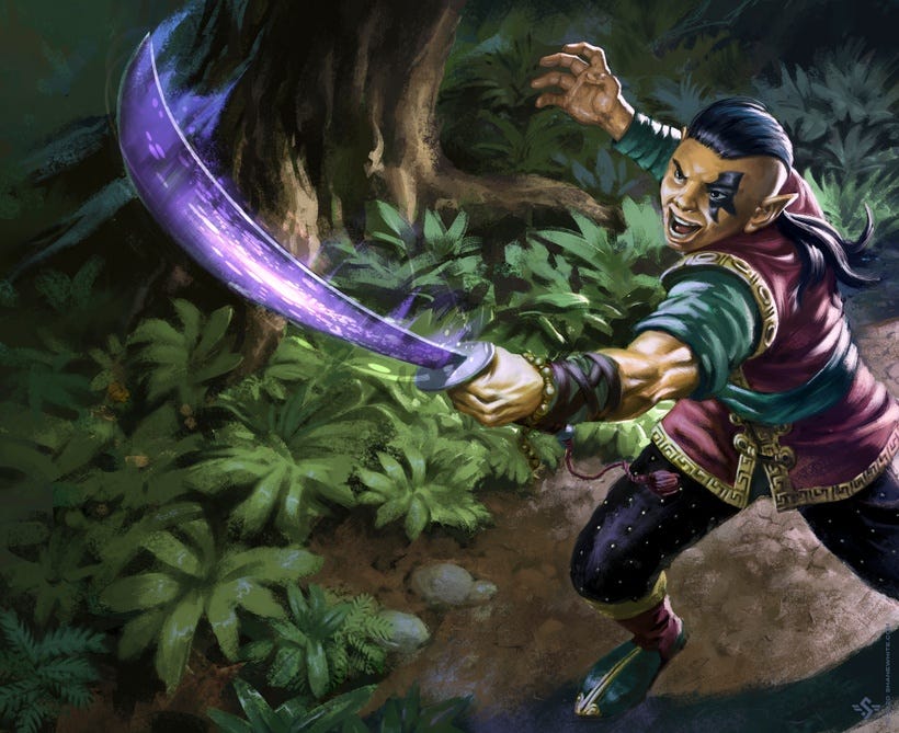
Photoshop has layers for a reason. Try stuff out, break things down to their essential parts and SIMPLIFY. So that's what I did. I kept some elements, like the main figure but I took everything else in new direction. Is it better than the original concept. Not really. In fact, conceptually this is quite pedestrian. Another problem with it is that the guy who painted this really liked foliage...so why isn't it more in line with the narrative?
Ultimately, it fails on many levels, BUT at least it's rendered with some modicum of confidence and grace. Except maybe the figure, he still looks over-rendered.
The best thing to come out of this for me is that I saw it through to the end. The lighting from the sword affecting the character feels pretty good. The brushstrokes on the plants are the way I would have liked to paint the entire piece. Finally, it's a stronger composition because I simplified everything.
It's worth noting a few things:
Solid thumbnails will help you see composition problems
Solid roughs will help you piece together lighting, ideas and flow to reinforce the composition
Solid penciling will finalize your lighting pass, detailing of clothing objects etc. and verify that everything is working together
By the time you get to the finish, you've seen the map to where you are going. It's just a matter of rendering color, dealing with brush calligraphy. The biggest decisions have been made; you're just putting a final coat of paint on the house. Skip any of these phases and you're in for a wild ride.
At least, that's what if feels like when I do it. Some people embrace the chaos and like the risk and their results may be better. Sometimes you can train yourself to accept the chaos by repeated exposure.
Art is hard enough to create. Give yourself a break and trust the process. You're more likely to have a favorable outcome if you do.
=s=