BREAKING DOWN COMICS
How Unique Storytelling Devices Define the Medium
Show less
There's a reason why comics are comics and storyboards are storyboards. Or at least they should be. While fashion and styles may change there are mechanics to the craft of storytelling...like cold hard cash, being left on the table that can make your work stand out. Today I want to look at several pages by a few artists that have the right idea.
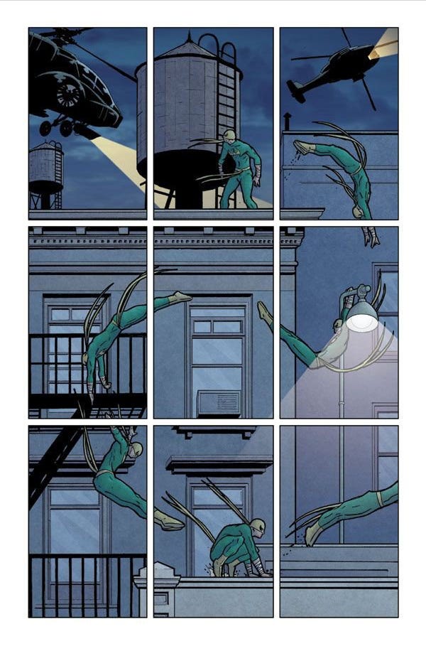
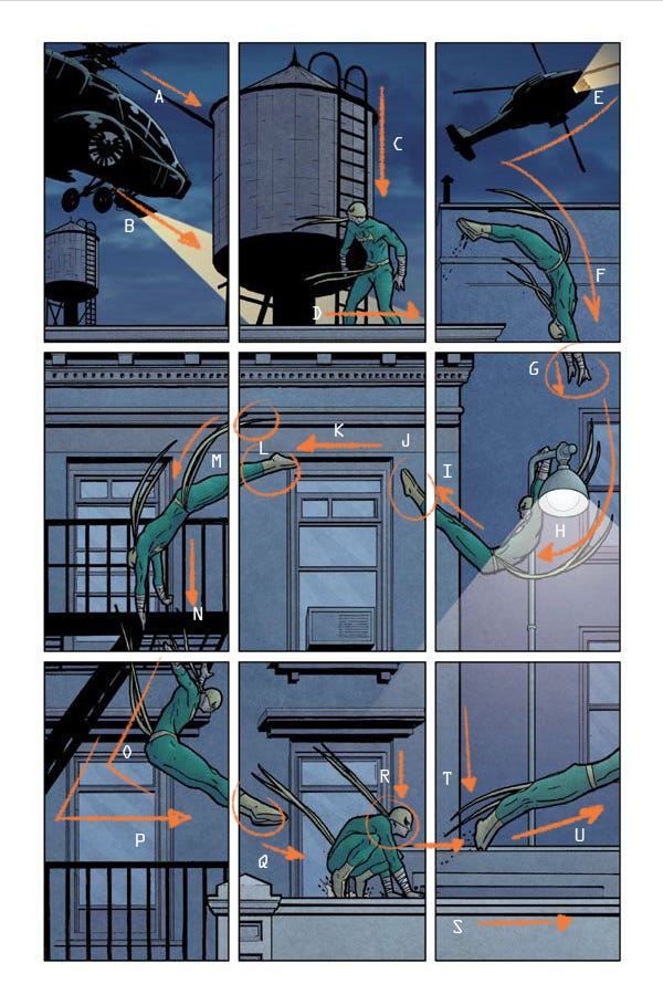
David Aja understood this with his Immortal Iron Fist work. Here's a breakdown of the page and why in both design, composition and flow, it commands your eye to follow the action:
A & B: The direction of the chopper pulls us into the panel pointing us to the next especially with the help of the colorist extending the light beam and the top of the building pushing us along to the vertex of a triangle where Iron Fist is standing in panel 2.
C & D: The weight of the water tower, rhythm of the tower ladder are driving a vertical down to our hero. Again, the building top is intersecting at the "sweet spot" of that panel. Iron Fist's organic belt and mask straps create excellent horizontals as well to break up the static of the hardscape.
E & F: The building top feeds us into the next panel. As the chopper peels away Iron Fist goes in the complete opposite direction creating a beautifully balanced panel. His dive leads our eye down to resolve where his hands are.
G, H & I: Traditionally panel SIX but the ACTION and STORYTELLING are driving our eye. We see the hands resolve and the window helps drive the action as well as the organic belt and mask straps wrapping the action around the light pole. Again, we're looking to resolve where Iron Fist's feet are which point up and out of frame.
J, K & L: I mean if you isolated this panel, it would be pretty weird, but in the context of the page it makes sense. The window frame also continues the horizontal movement to what would traditionally be panel THREE. We want to resolve the rest of Iron Fist and so the belt straps pull our eye to the next panel.
M & N: Again, David uses strong verticals and rhythm of the fire escape to pull the direction of action down. The breathing room in these panels is so great. We catch a glimpse of Iron Fist's hands, and we know the action continues.
O & P: Because the fire escape is so dense black it creates a strong weight. But what's this...it wants to lead out of frame, direct our eye away from the action. Luckily the action is also framed by the railing and better yet...Iron Fist is also resembling a similar "L" shape that is driving us toward the next panel.
Q & R: The feet lead us in and the window vertical and mask straps emphasize direction as Iron Fist lands.
T, U & V: Now there's really not much leading us to this frame other than the roofline. But now we have the vertical of the building and leaping angle of Iron Fist breaking the grid of horizontal and vertical elements. It's hard not to take notice as he leaps out of frame. Granted there's a weird tangent with his toes which doesn't help give him loft. But overall...this is a solid page because of all the BIG CHOICES David made.
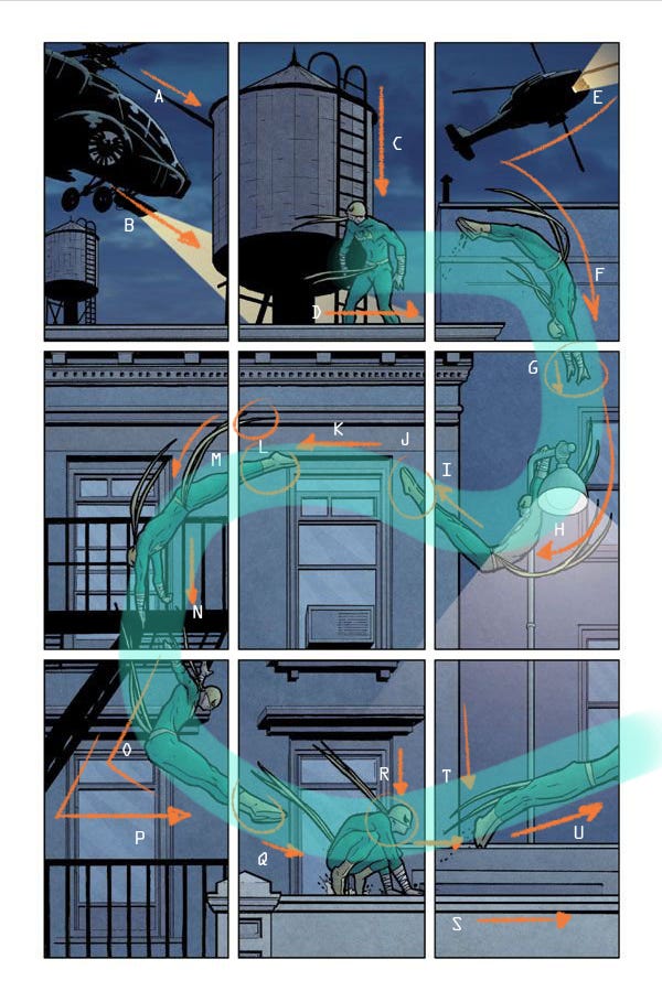
Here's another way of looking at the FLOW:
Sure, this is a standalone page.
How can anyone sustain that page after page? Would it become exhausting or tiring? Or would it whip you through a comic or scene with ease?
Something worth pointing out is how much of a diorama this layout is. Fairly simple...on the order of something that CHRIS WARE would have achieved with the same if not equal connectivity and eye flow from panel-to-panel.
Here's a page by FRANK QUITELY with a little more dimension taking essentially the same route as DAVID but involving some cut-ins for Medium Close-Ups without losing the pacing of the action.
In this instant the dialogue is helping drive the action. The word balloons are overlapping panels asking us to resolve where they're coming from. And because of the 1-point Perspective Frank is taking the opportunity to play with depth and even break-away for a Close-up on finger that still points us quite literally to the last panel.
But let's go one step further...
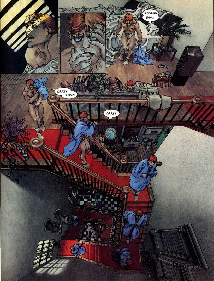
FRANK MILLER in his ELEKTRA ASSASSIN Graphic Novel had this beautiful page colored by LYNN VARLEY.
Using 3-point Perspective Frank pushes and challenges not only himself but the viewer to follow Matt Murdock in this impossibly laid out floor plan. Lynn Varley's colors are important here as RED is used to have our eye follow the path of action of the story as well as Matt's descension into a very dark and dank space. Does this reflect Matt's state of mind? The Golden Ratio is in full effect here. If you're not familiar with the Fibonacci Curve, I'll be talking about that later.
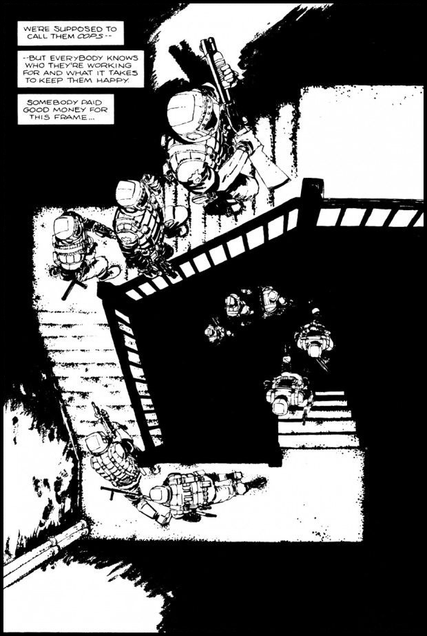
Frank liked this idea so much that he tended to use it in a different way.
In this more graphic approach, the characters are ascending from dark to light. The rhythm of the stairs causes our eye to follow along with where the guns are pointing. Our eye circles around the stairs to the point of origin.
In these examples, these would be more like set pieces of an entire comic. To sustain this level of storytelling is more conducive to stories and storytellers like Will Eisner. His work was expressive and mirrored theater and vaudeville as well as creative approaches to film lighting while at the same time espousing the mechanics of not only good comic storytelling but great draftsmanship and design.
Hopefully, you're as inspired by these as I am and maybe they too will inform your work.
=s=



Oh hell yeah, that Frank Miller page is one of the best comics pages ever.
Oh yeh! This is the good stuff.