

COLORING COMICS For PRINT
How to AVOID COMMON PROBLEMS

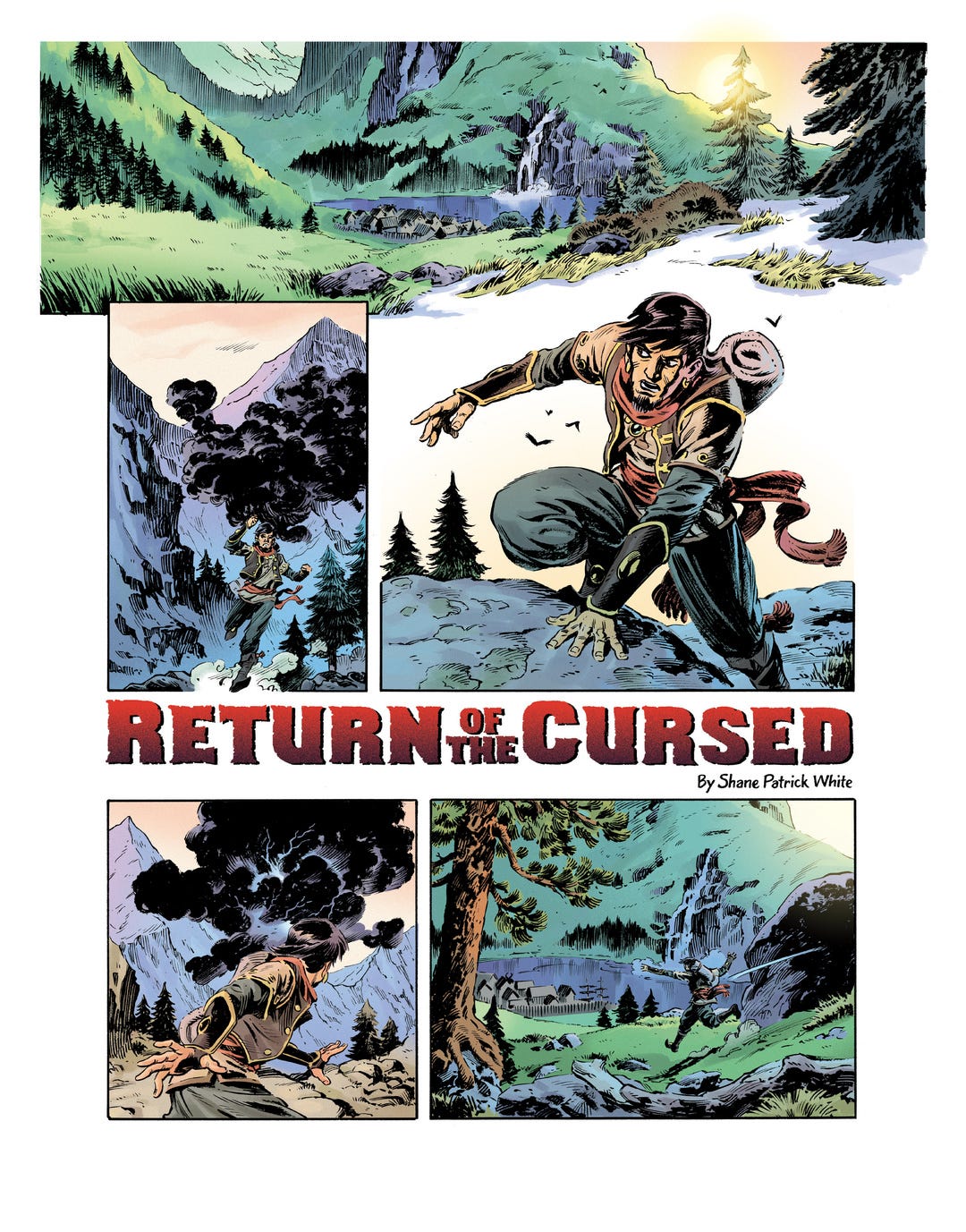
Finally, after so many years I’ve finished what I started. Did I tell you that I actually had approached three different people to draw this story. They were all excited, only two did a few character sketches, but ultimately no follow thru. C’est la vie.
What’s that saying about doing things yourself? 🤔 Yeah, that!
Unfortunately, I still want to collaborate with people and if money is the point of entre then...that’s gonna be a no-show for most people much to my chagrin.
Anyway, here are the remaining pages of the story for you to check out.
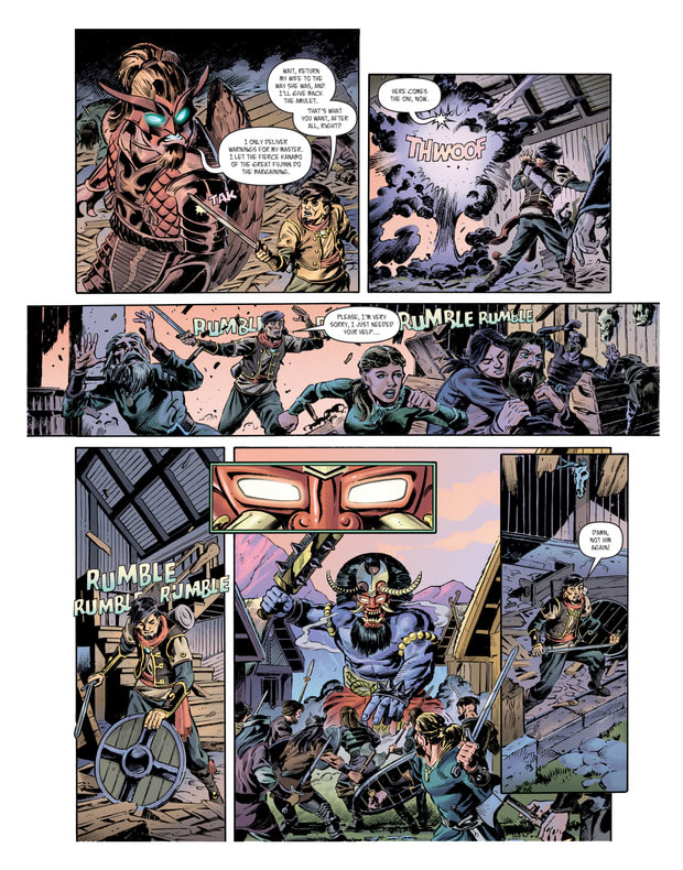
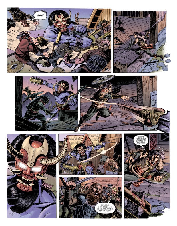
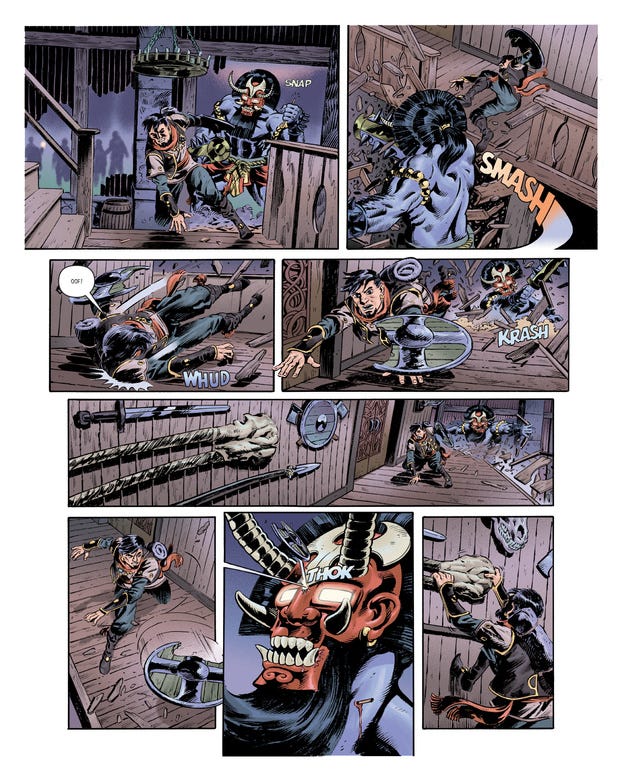
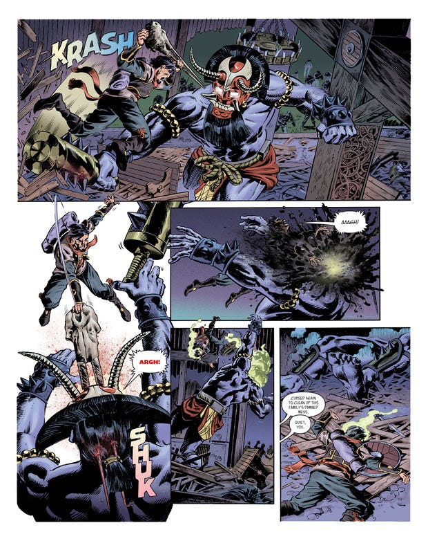
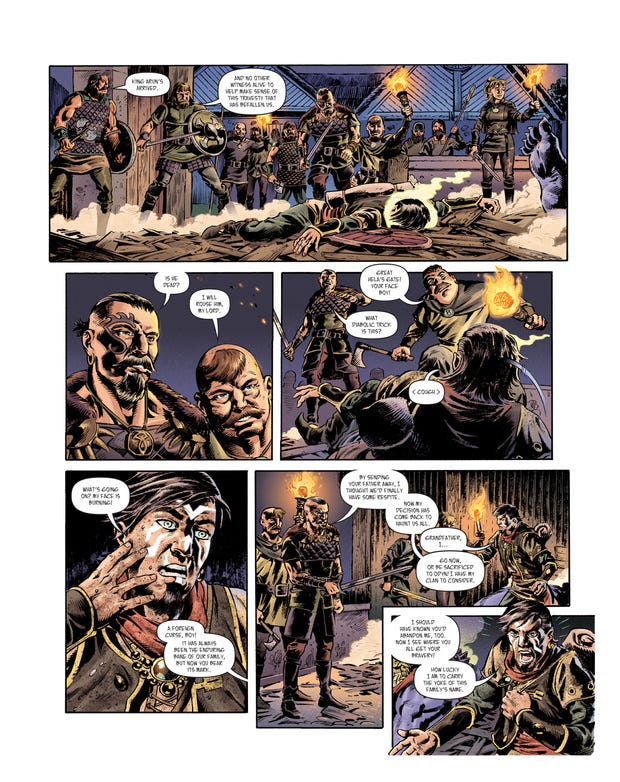
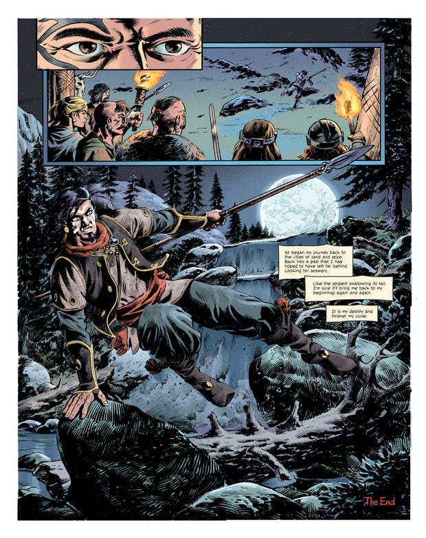
But, do you want to see something crazy?
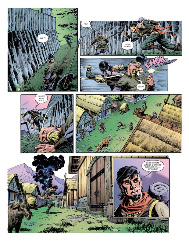
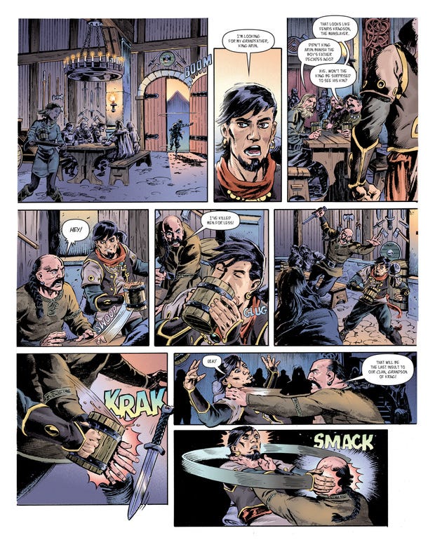
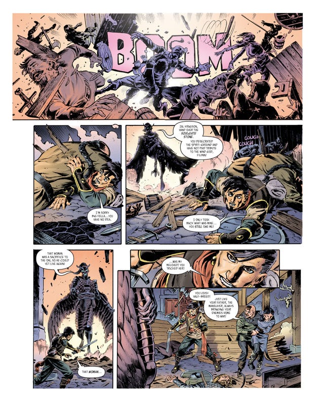
Here’s the way I had originally colored this story:
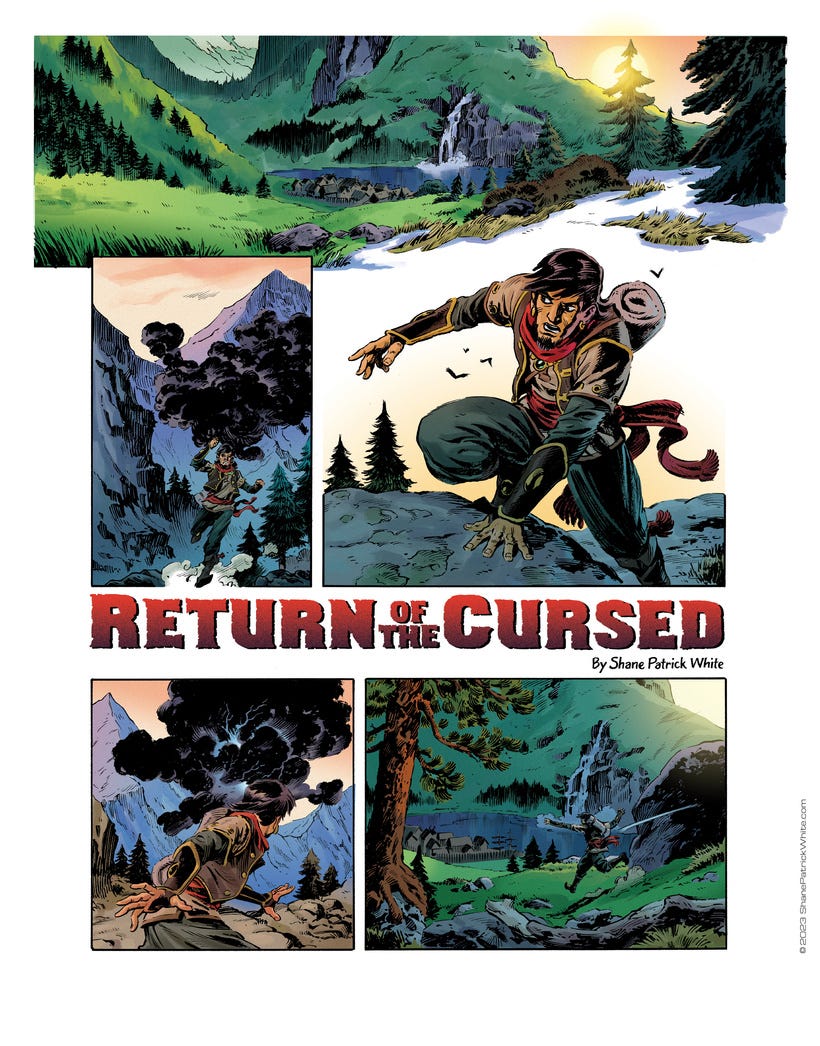
It’s normally how I see color and light when coloring comics.
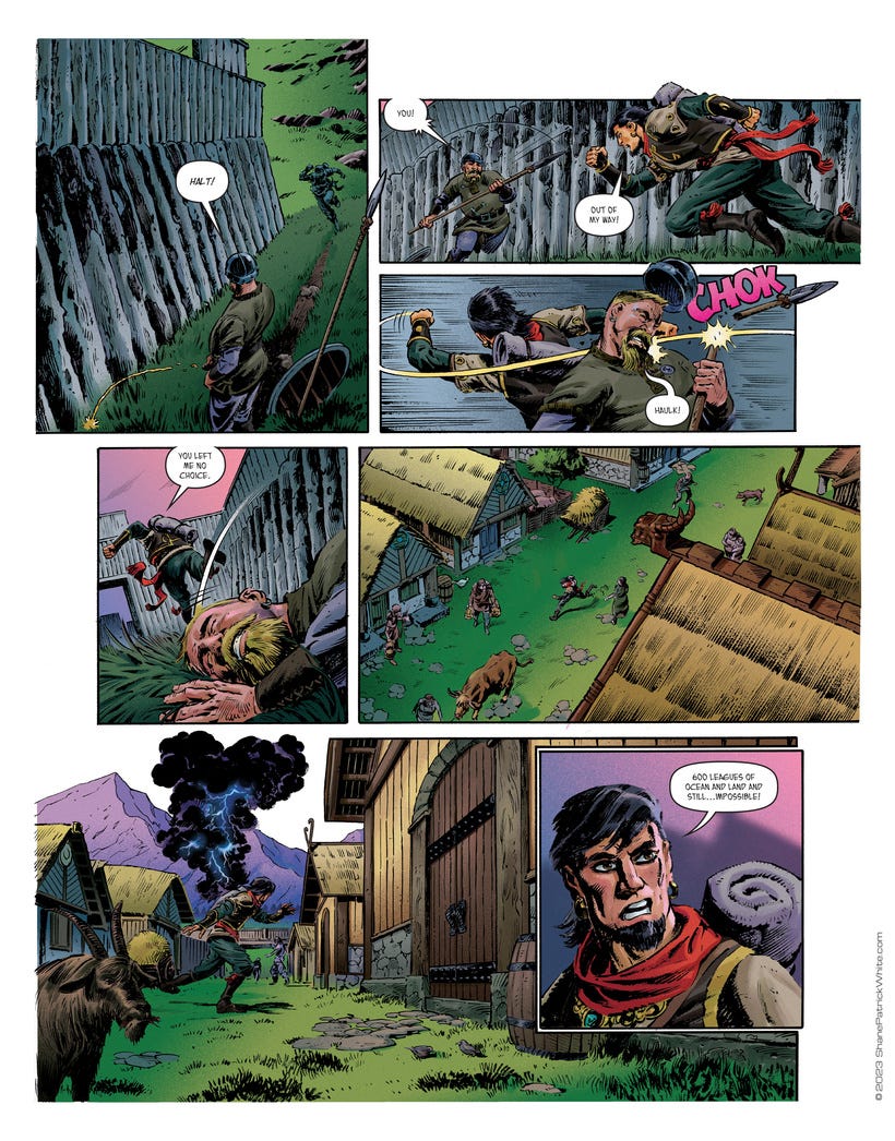
But part of the problem I was having and the trap I was falling into, was that I was burying the inks. Something I’m always railing against...and thought I was avoiding.
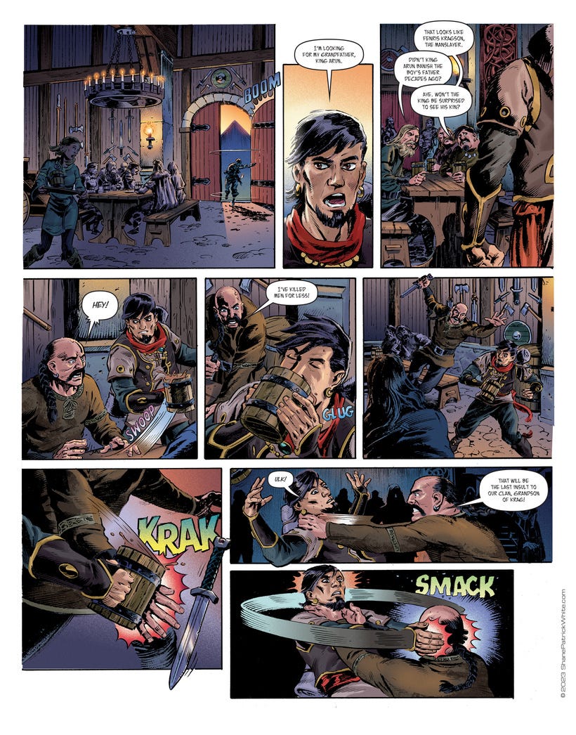
But no. I was doing myself a disservice. As much as I love pushing rich colors I was doing myself no favors.
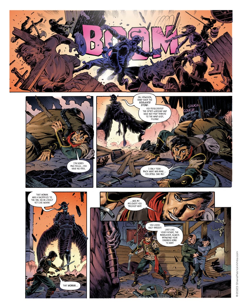
What ends up happening is that the lighting and color become the predominant thing. The cinematography, while accurate to my taste and serves the tone of the story does not add to the conversation that the inks started.
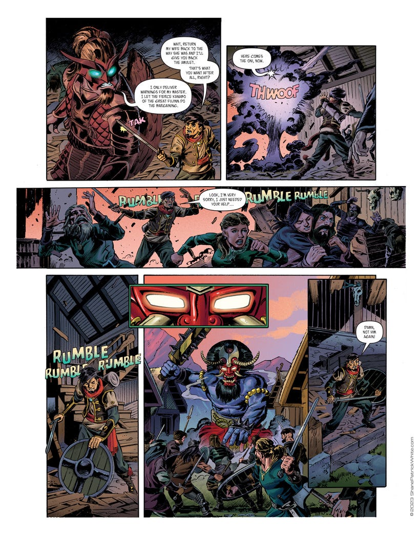
If I had simplified the brushwork and didn’t put as much texture in there then yeah, we’d be looking at these pages as the final. Inherently, I still love a lot of these colors. They’re seductive, they feel right...but unfortunately, they don’t play well with others.
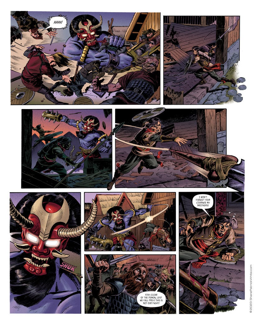
I think it was around this page is when I realized something wasn’t working but I couldn’t figure out what exactly.
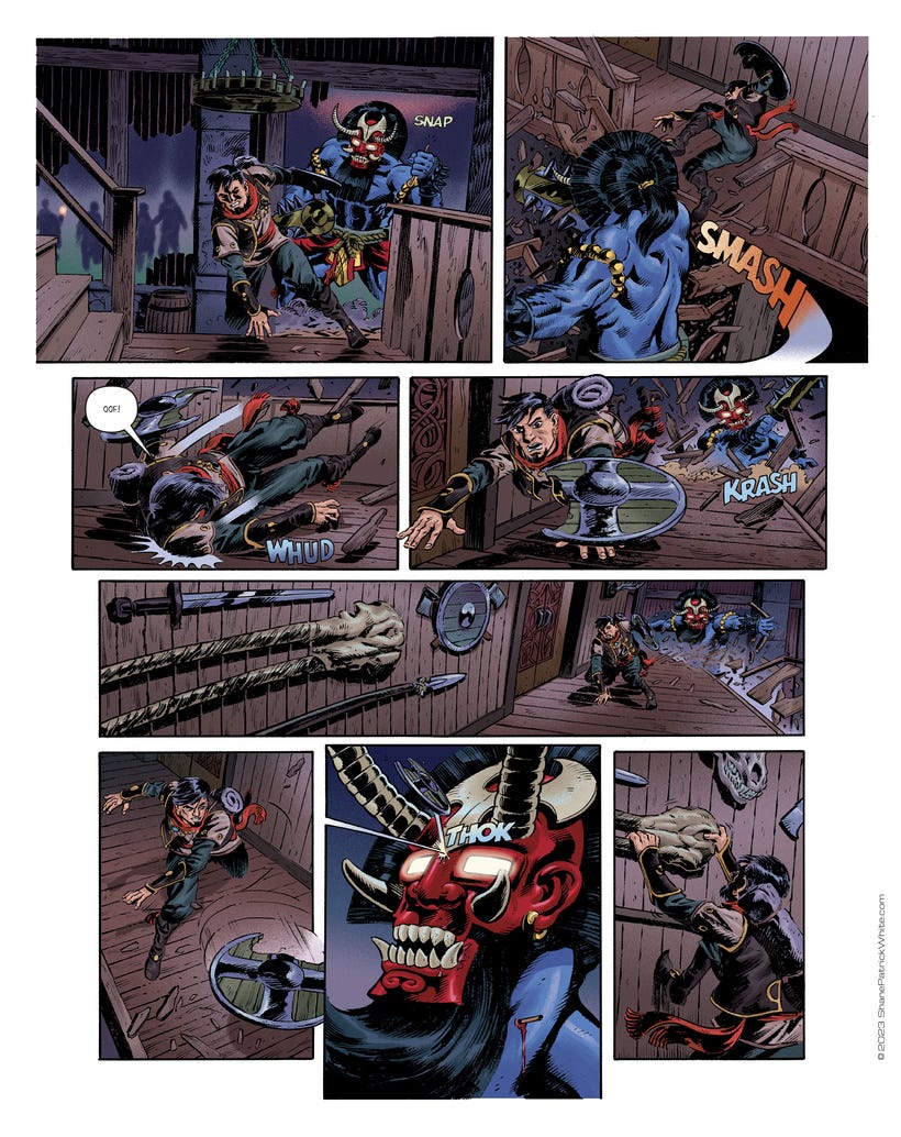
That’s why it’s important to share the work with friends and people you trust, swallow your pride, and ask for feedback. When I did, mostly everyone loved these pages.
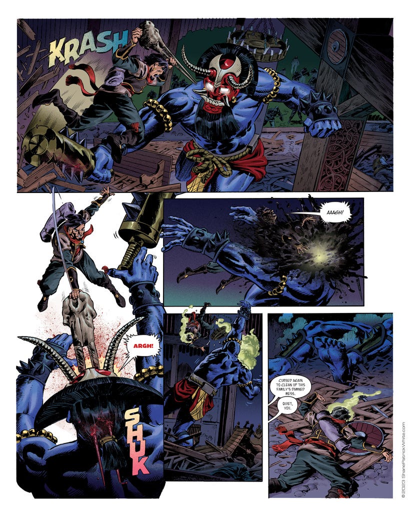
Maybe it was the excitement of seeing something new. But later, when I had a conversation with a close friend, I told him I still didn’t feel like these were it. I said I think I might have to lighten the pages or recolor it or something. He agreed. Hearing his agreement was like getting permission to try something. And yet...how much work was it going to be?
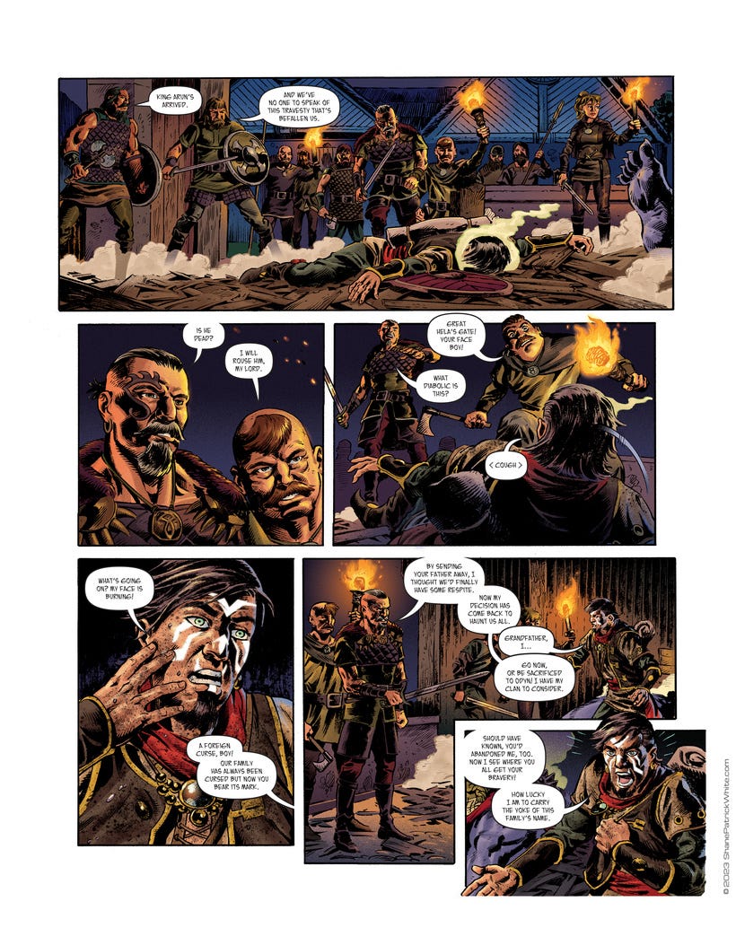
It turned out not to be too much trouble at all. I went in and literally lightened everything BY HALF. 50% lighter and I cranked up the saturation to bring the colors back from being washed out. I mean comparing the two sets of pages, it does look washed out BUT...nobody outside of our friend group will see what had come before.
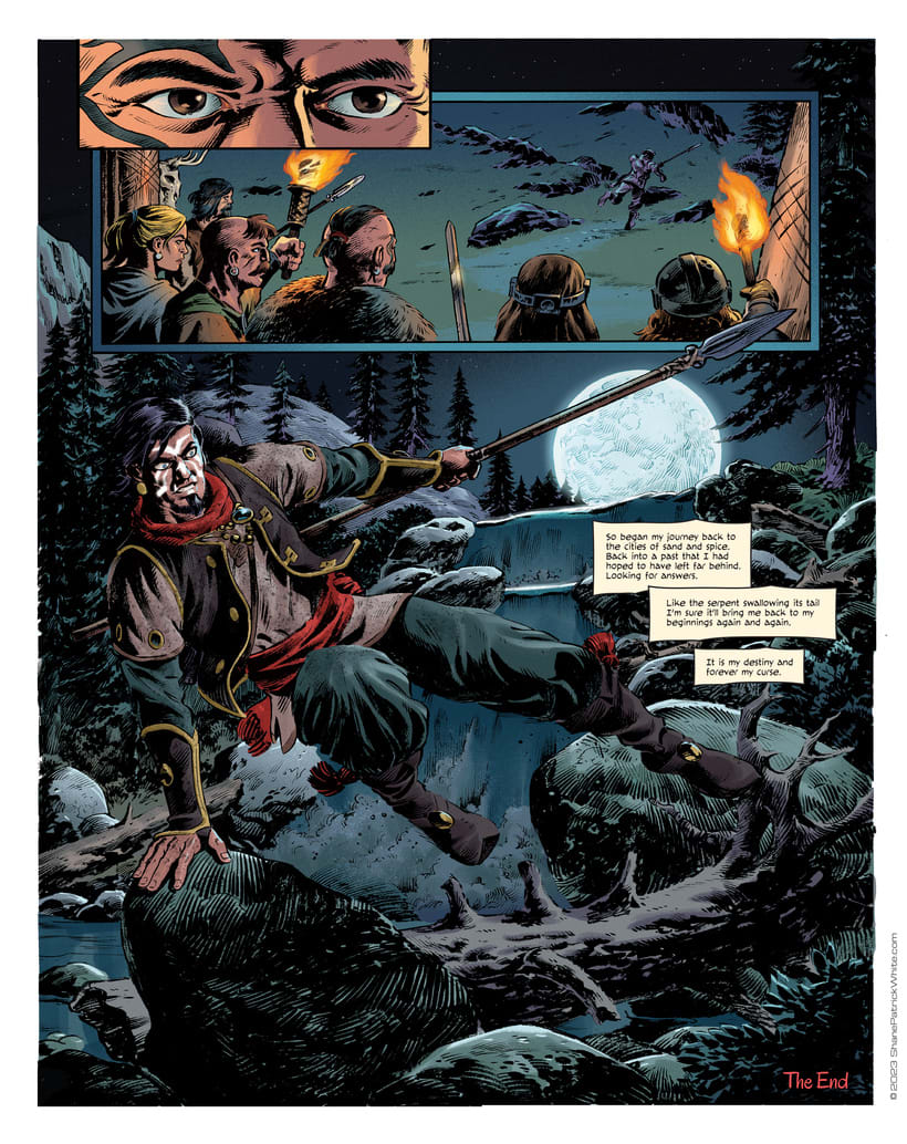
The other saving grace about this decision is that colors have a tendency to print darker by 10-20%, especially with the ubiquity of digital printing these days. If I thought the color was burying the line on my computer then, there was no chance in hell I’d like the end result.
As of this writing, I think it’s been about 4 years, this project still hasn’t come out. Apparently, there’s been a spate of bad luck all along the way that has delayed this from hitting the market. It’s sad really. I would never want to take on something where you have to herd so many creative cats who are all doing work for free.
At least now, I have hope that it’ll be readable, that the beautiful black brushstrokes will ring true. Fingers crossed. You never know how these things will turn out, no matter how much effort you put in.
=s=