

COMIC PRODUCTION: Layout & Penciling
What's it Take to PRODUCE Over-sized PAGES?

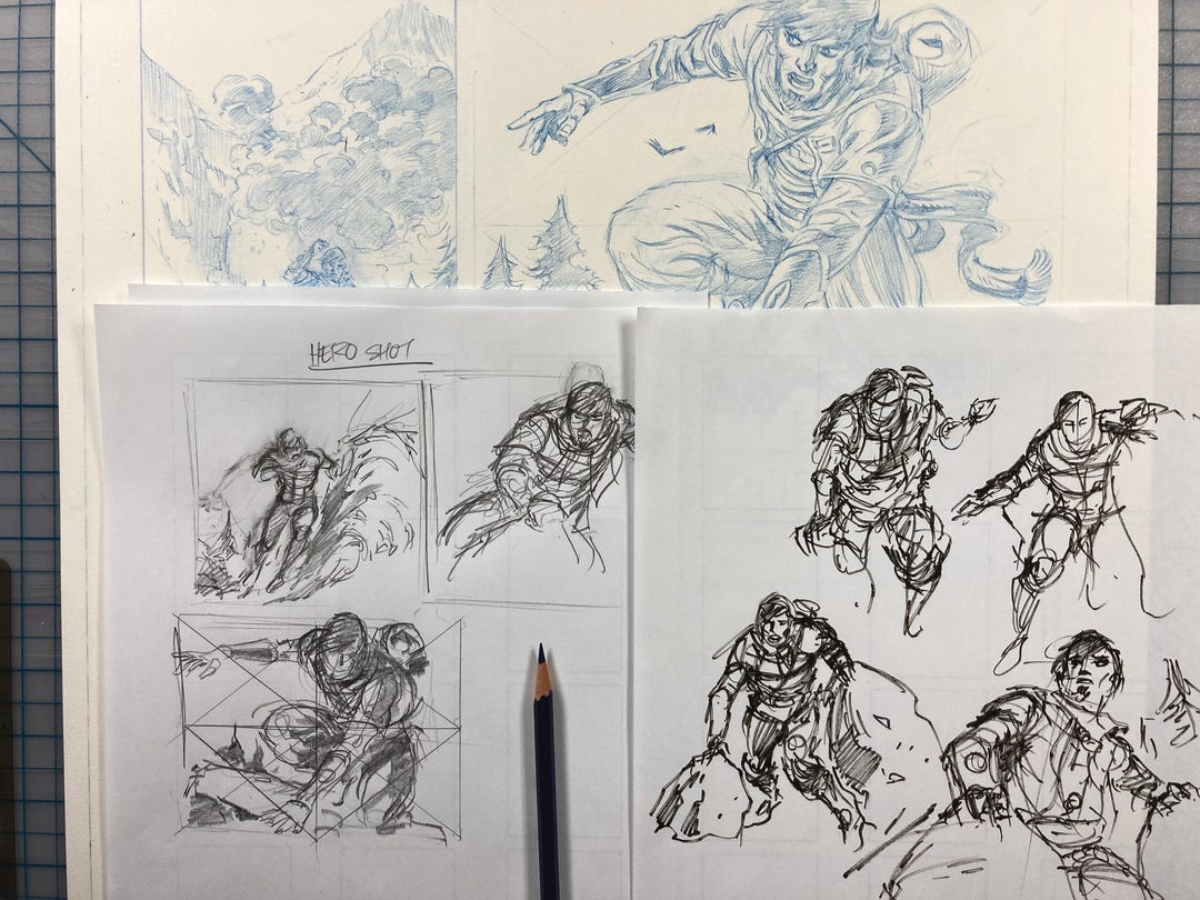
I’ve had this story brewing for years. I probably wrote it around 2010 or so and it’s gone through a few iterations. But the core of the story hasn’t changed. Now I have an opportunity to get it published in an anthology from RAID! STUDIOS. I’m super-excited to share my process of how it’s coming together.
Prefer a downloadable PDF? Get it here.
Originally the main character was named Hadar Kleg. Why? I have no idea. I was looking for a unique name at the time and landed on it as a placeholder. Conan is a perfect name because it starts off with a hard consonant. On a cover it’s easy to read. I wanted the same feeling even though Zal Kragson’s name would not be on the cover. Usually it’s fairly easy for me to come up with names I really like. But this one I’m still getting used to.
Admittedly it took awhile to land on Zal. I needed something both Middle Eastern sounding and Nordic. Because he’s a complex man with an even more complex past. I wanted a hapless character how bungles his way through life and has dumb-luck on his side. Zal is relatively easy to type...which is also a very important consideration. I just read a book by Toni Morrison Song of Solomon and she had names in there like Corinthians and Milkman Dead. I mean...jeez...save yourself some typing if you can.
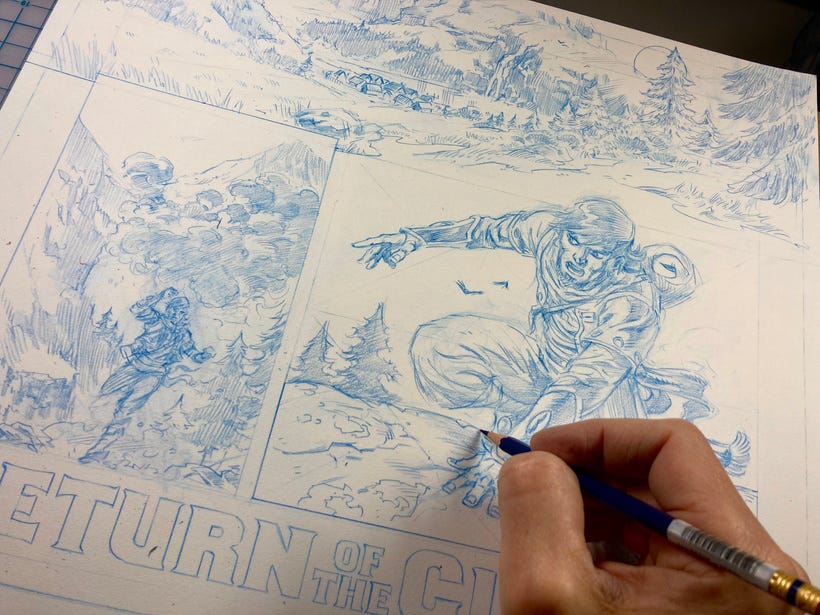
These pages ended up being 16.5” x 20”. That’s a lot more real estate than I was used to, but the beauty of that was also evident in how much more freedom of arm movement for drawing big landscapes. Part of me was thinking about the final oversized format of French BDs which this RAID anthology was setting up to be.
But it also got me thinking about monthly comics. Back in the Golden and Silver Age of comics, pages were “twice up” instead of today’s standard “1.5 up”. When art is shrunk down it tightens up and looks better. Shaky lines become much less noticeable. That’s why it’s amazing to see those ARTIST EDITIONS of WALLY WOOD and see how loose everything was on his Weird Science books. Meanwhile, us artists are trying to match the tightness we see on the printed page which while it may be a fool’s errand, when that gets shrunk down, the life gets squeezed out of it.
Which is another great reason to collect original art if you can afford to.
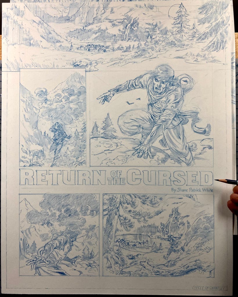
Because so many artists are working exclusively digitally, there’s an infinite amount of zooming in that adds more detail to a page when working at 600dpi. Our eyes and hands can only handle so much detail in practical terms. But with the aid of brush stabilization people are getting amazing results. How does a traditional artist compete? My theory is to DRAW BIGGER.
I contacted Mitch Gerards (Sheriff of Babylon/Mister Miracle) and asked him what his schedule was in terms of delivering a book. I believe he does everything from pencils to colors. 8 weeks is what he told me. That’s nearly two months.
A lot of digital artists are toning their pages too, which adds time but doesn’t net them any more money. Many of these people live outside of the U.S. where our dollar goes further for them. If they’re getting 6-8 weeks to work on a book, that’s still a lot of work.
If a traditional artist was given the same amount of time and was working bigger, then maybe it would work to their advantage. It does take longer to pencil a page. But I also noticed it takes a long time to ink digitally. So maybe it all comes out in the wash so-to-speak. Though I have heard too that larger art pages may be harder to sell...but seriously...who wouldn’t want a bigger Batman page when everyone is working digitally these days? Look at the future...there’s going to be less comic art available and that means the older art is going up in price. Supply...and demand.
There’s no way to really test my theory other than to say, these pages took a long time to draw and even longer to ink. For ten pages...I think it took me almost two months of seven days a week. I wished I’d kept closer watch of my time.
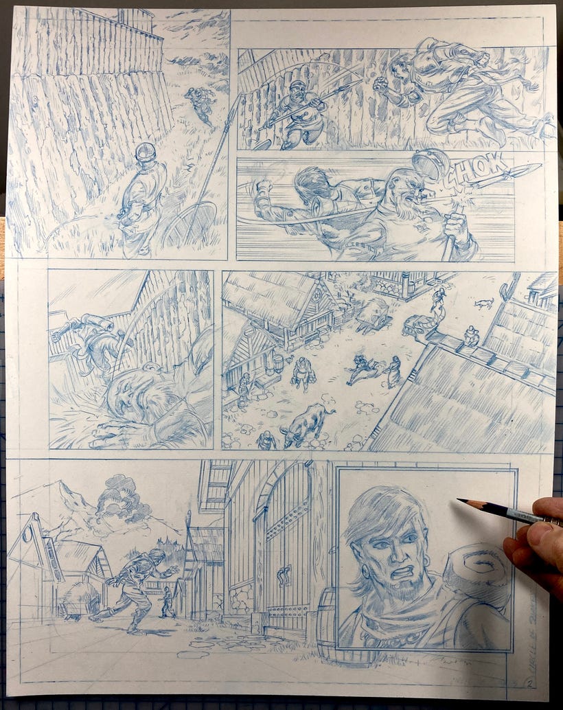
The paper is a rough Strathmore 500 series 3-ply bristol. The sizing makes dry brush very easy. But that also means coverage takes awhile when it comes to filling in your black areas. It’s a great look and the meaty paper feels like you can really punish it and still come up with a clean line if needed.
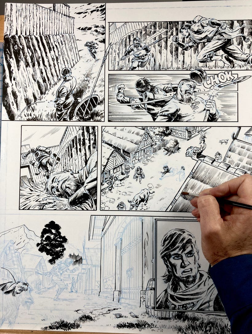
If I remember correctly, each page took about a day and half to pencil. And a day and half to ink, depending on the detail. Because I was using 3D models and my main character and villain had a lot more detail I was constantly in need of checking reference for spatial relationships and size variations.
Coloring...well...I actually hired a flatter from the Philippines to help save me some time when I realized it was taking me a day to flat a page. Insane! For $10-15 you can get a flatter and save you some time. I gave him color guides to work with and he was fast. I’ll definitely be using him again.
Another lessoned learned was when I designed the ONI’s head mask, I designed it from one angle. It wreaked havoc on me when I had to draw it from the back or other weird angles. LESSON: Draw every design from at a minimum of three different angles until you can get a better understanding of how it works. And then draw it again and again to commit to memory.
Because of the time crunch I wasn’t able to do this.
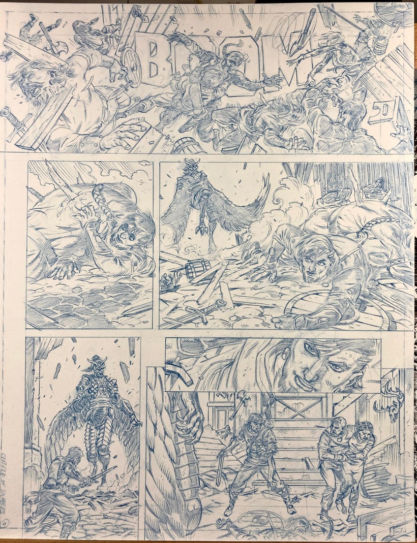
It really did not help that I had scheduled a two week trip to visit my parents. I mean it helped me for my mental well-being as I had been working seven days a week since February. It was good to come back revitalized and not feel like I was doing drudge work. Still, I needed every moment I could get to hit the deadline but I couldn’t believe how slow these pages made me feel. I started having serious doubts about...well everything.
See, this was supposed to be a test run for my AUTUMN PEOPLE project in a lot of ways. It’s a 156 page graphic novel...and if it was taking me this long, I was looking at a VEEEEERY LONG schedule. I’m gonna be 53 this year...and if it takes seven years...egads! And there’s no guarantee that it’ll get published or that people will be interested in reading comics the same way. Anyway...I was really facing a great conundrum here.
Usually when I lay out a page it looks like this:
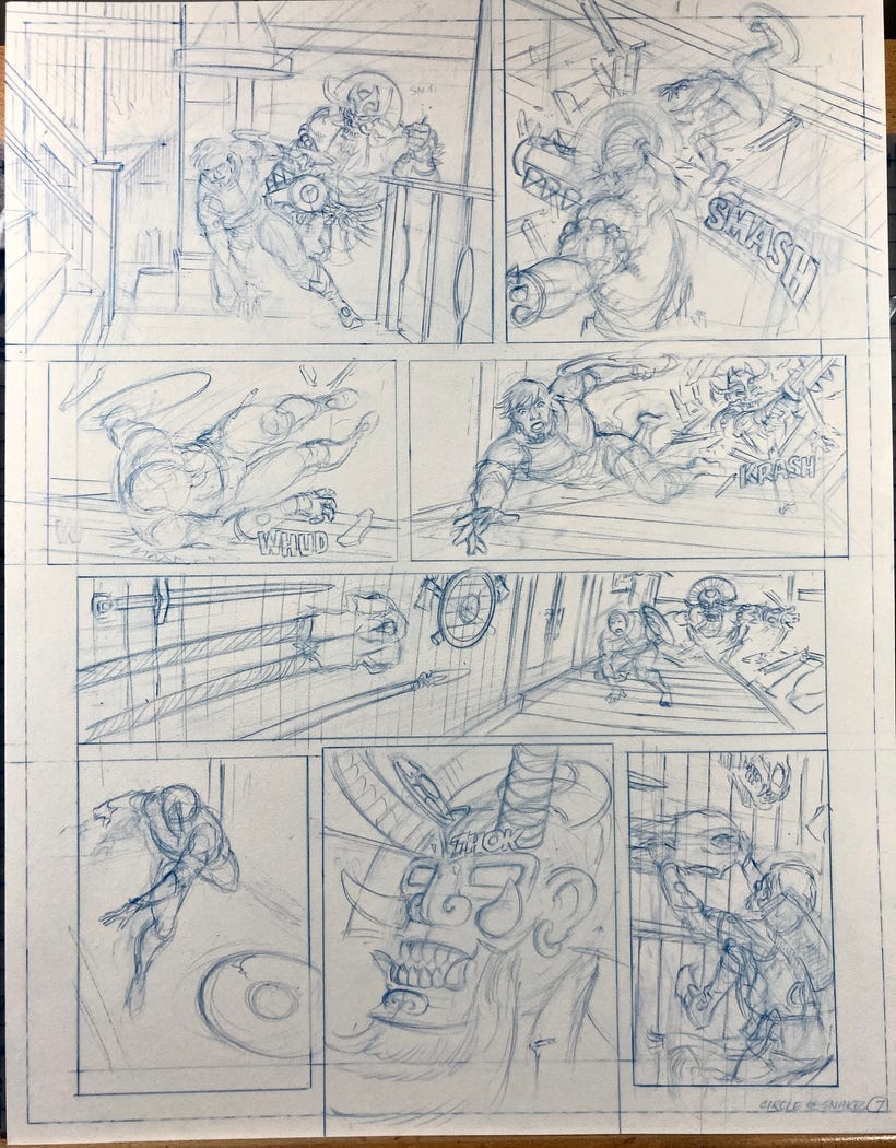
My initial goal is to lightly go in and get the FEELING down for each panel, making sure I have a nice balance of close-ups, medium shots, and long shots. With this many panels on the page it’s hard to create an overall page design with a focal point. But at the very least I do try to lead the eye from one panel to the next by design. In comics that’s what’s considered good storytelling. If you can also maintain good camera rules then you’re golden.
I’m not sure as many newer pencilers have this in the bag. There’s more of a cinematic push in a lot of books. A lot of hero-poses and the like. While tastes change, it’s still important to keep the art and craft alive. If you can push those boundaries, even better.
Because I have more than six panels to a page I felt some restrictions. I used the bleed areas of the page to open up some panels and bring them to the edge of the printed page while being keenly aware to keep the relevant action and potential word balloons within the trim lines. In the below example the dotted area is the trim. Panels that are smaller than that are the safe area. So if you see the word SMASH you know it’s just within the safe zone.
Panel sizing and deleting some of the borders was a way to create an openness and style that I’d been experimenting back when I started working on BRAUN. I like it and hope that I can continue to push things even further. It always depends on the story.
Well that’s it for now, thanks for reading, and thanks for being my patron. I really appreciate sharing with you all. I have some really interesting projects coming up that I can’t wait to show. It should be fun.
=s=
Amazing article, thanks for sharing your experience and challenges on golden-age sized comic pages! I was looking all over the internet searching for exactly this topic and how to takle it in timely manner, found nothing until now. Especially the information about the paper dimensions and who was working that way in the old days. Yes definitively it takes longer to artwork those super-sized pages, but it pays 100x off if you ask me. The results are astonishing. And don't forget: You can sell an "Artist's edition" of that book because you HAVE the line quality in bigger size, that adds value to your work as it can be sold in larger formats like I can see in European graphic novels. No wonder that only old, golden-age comic books from super-good inkers like Romita are available in this format ;-)
Great article and your honesty is always appreciated. Personally, I've always preferred the blueline stage (with or without pencils), which is often wrecked by inks. To say I was nervous to keep scrolling is an understatement. However WOW your inks are gorgeous and took nothing away.
FYI the article repeats itself beginning with, "Originally the main character was named Hadar Kleg." ...
Awesome regardless, but thought you should know.