

COMIC PRODUCTION: Pre-Production
How to CAREFULLY PLAN Your PROJECT to AVOID HARDSHIP

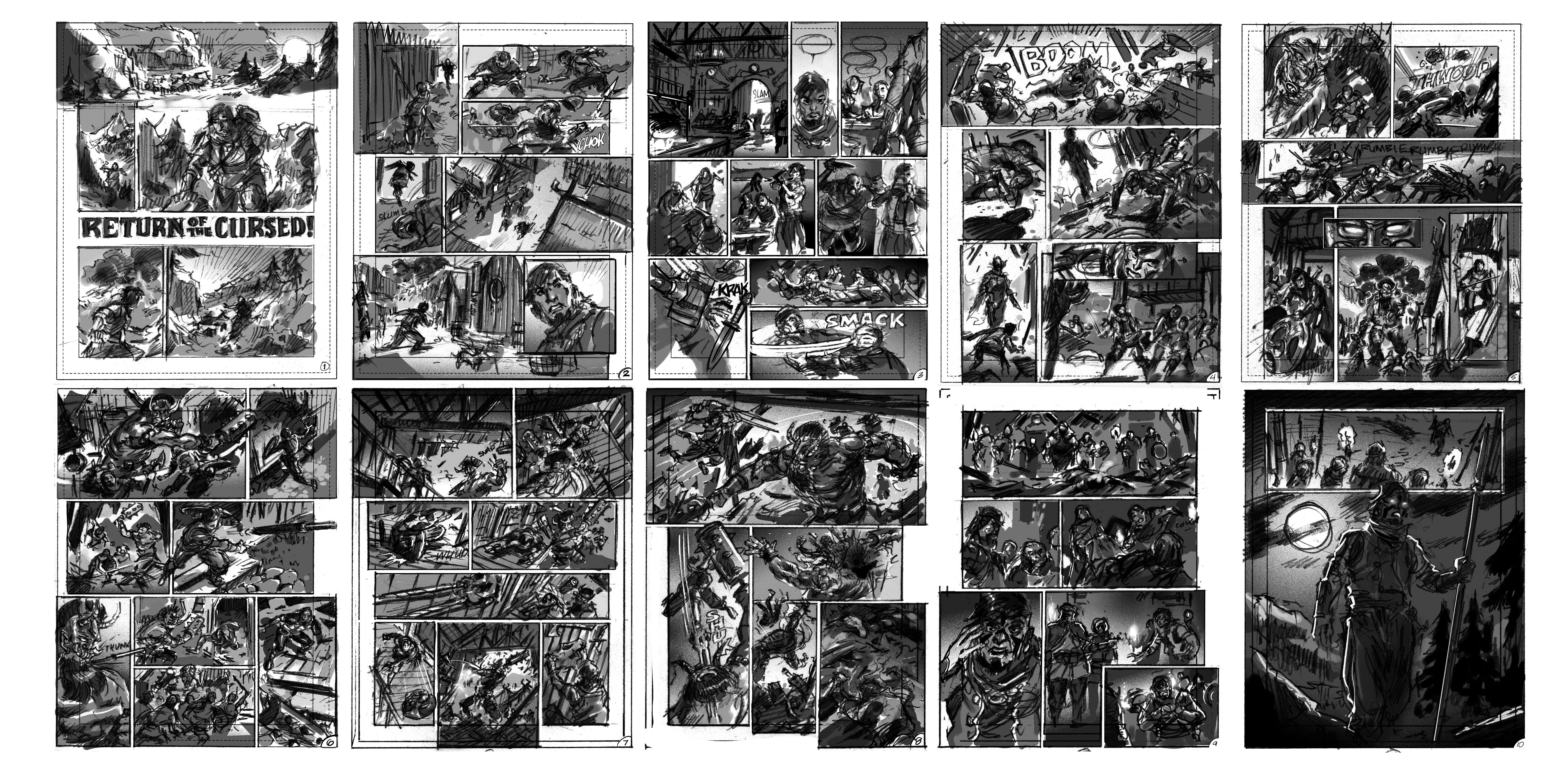
By the time you read this CIRCLE OF SNAKES: RETURN of the CURSED should be out in the wild for you to enjoy. But how did I get here? What were the steps taken in my first attempt at a FRENCH BD format?
Because of the panic I was feeling about not advancing my concepting skills while embroiled in this comic project, I incorporated more 3D modelling into pre-production than I had originally planned. Here’s how that went…
Prefer a downloadable PDF? Get it here.
When I initially submitted my roughs, Ramon Perez, the artist (AD?) who is looking over all the work had given me some notes. He suggested emphasizing the action a bit more on the page as some of the panels seemed to be too much of the same size and needed help giving more focus to the overall page. It’s an easy problem to wander into as one is trying to convey the action throughout with a large number of panels. French BDs don’t rely so heavily on that ONE PANEL emphasis that draws your eye toward the page like American comics. However, it’s important to not make the shots pedantic. My hope is I can take the best of both American and French comics and come up with something that still feels exciting.
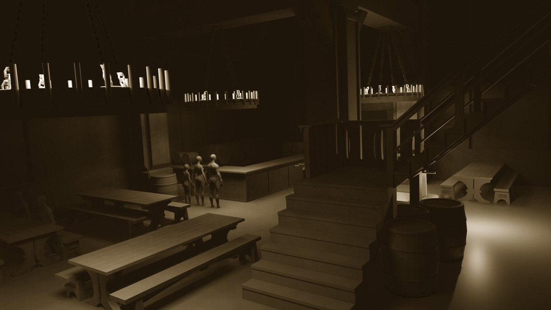
Once I had the layouts approved, I realized a large portion of the action took place in a Viking public house. Because of the complexity of the scene, I really needed to understand Zal Kragson’s relationship to his environment as he was running away from the Tengu, a Japanese spirit messenger.
More importantly the 15 ft. tall Oni that was going to confront him needed to be able to fit within the space as well. Oh yeah, and there are stairs to a second-floor loft of rooms.
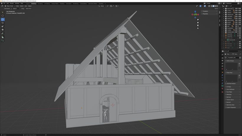
I didn’t have a lot of time to really do this design justice. If I had to do it over, I’d make the second-floor loft around the back and both sides of the public house. But for the shots required the angles chosen would have all the relevant and interesting things accounted for.
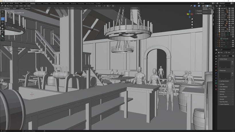
Because I wanted some level of accuracy in terms human scale, I pulled down some 3D human models from CG TRADER for free. This helped at least keep me honest so that when it came to rendering from various camera angles, I at least had a guide.
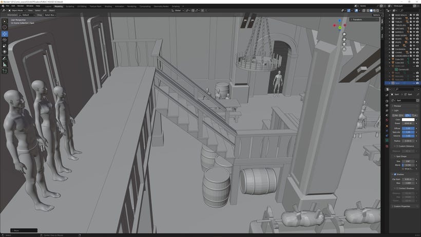
Checking and comparing angles from the thumbnails throughout the modeling process helped as well to feed the right scale for action as well as having good sight lines throughout.
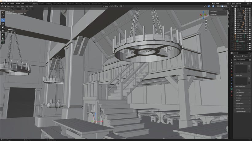
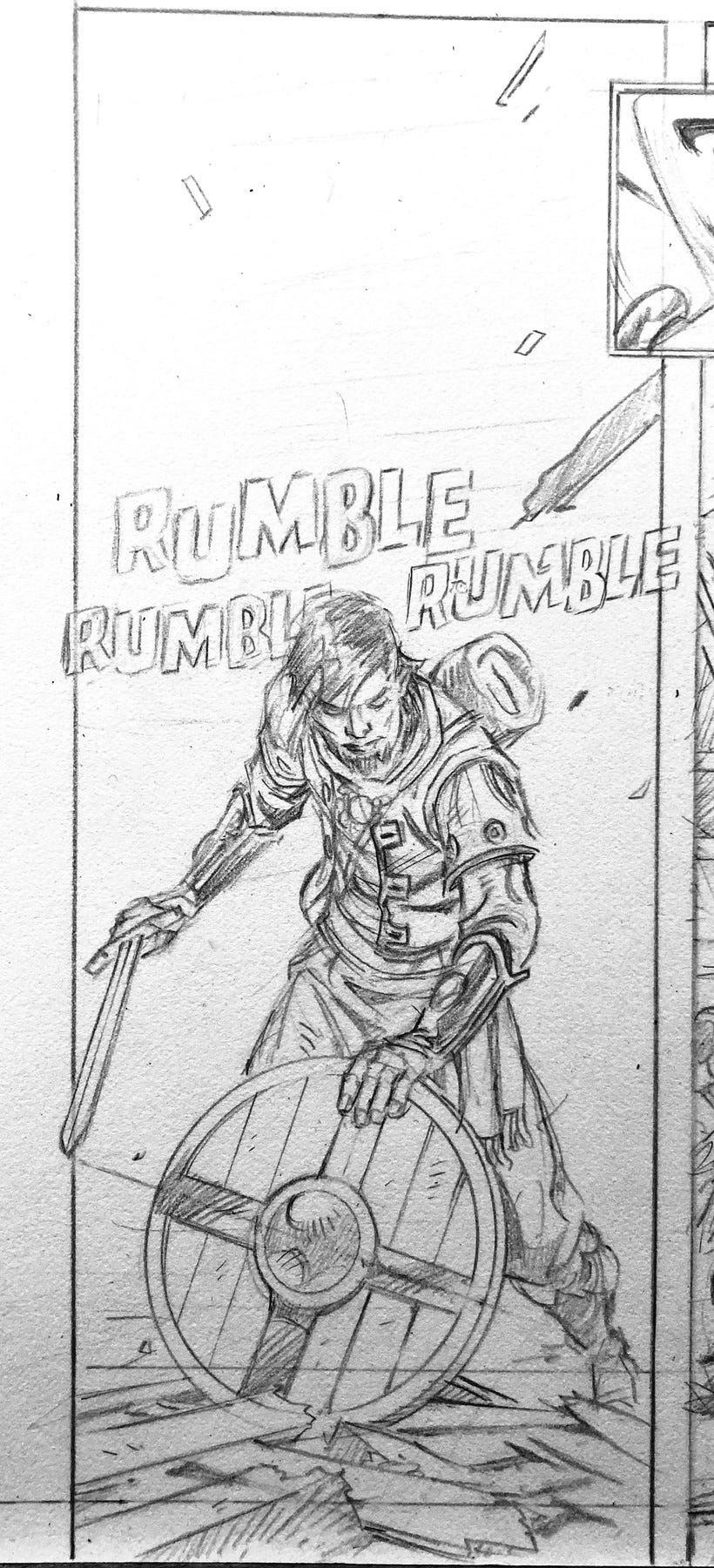
The overhead candelabras were the detailing feature that made the space less generic. A lot of the other detailing (like weapons, decorations, etc.) I’d handle in the pencil stage. Below is a panel that I drew but because of the complexity of the shot I needed to get the right background angle setup. I did a screen grab because I didn’t have time to light the entire space.
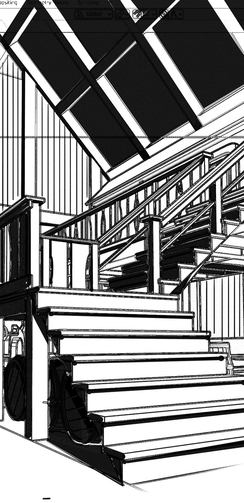
Measuring the final panel size, I then took that screen grab, scaled it accordingly, and spotted blacks on what needed simplification. While this model did take me a LONG time to create, it was far easier to do this than to monkey my way through accurately drawing this. Some things aren’t worth the headache.
Some of the other preproduction included having to address the character design of TENGU, the messenger.
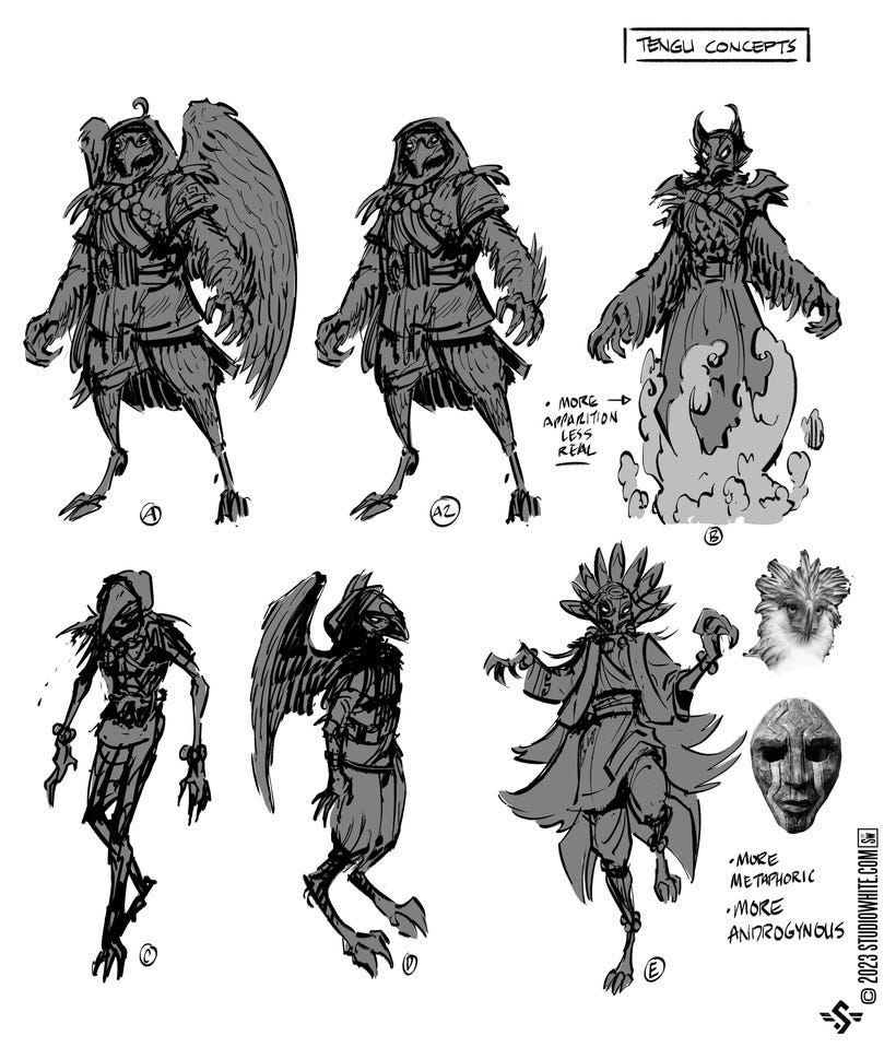
I really liked E and have no idea why I developed A. But I went ahead and threw some color on it for some unknown reason. I might have thought E was too Aztec in nature...I can’t really remember.
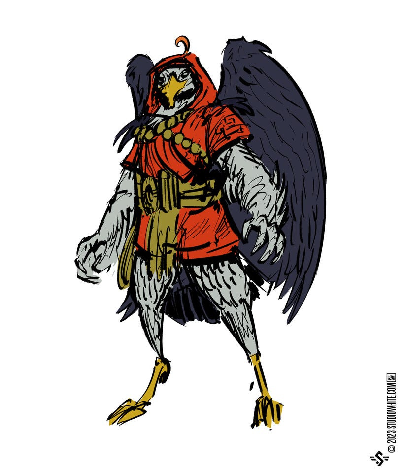
By the time I finished I couldn’t help but think he looked like YE OLDE CHICKEN from some Ren Faire. Not Japanese in mythic origin in the least! I abandoned this but it’s not to say that the work was wasted. When confronted on the page of what I wanted it to look like, I eventually found what the character needed to be.
If you can tell, this can be a battle with oneself throughout. Whether I was too lazy to turn on my computer to retrieve this concept sheet, or I found an easier silhouette that I came up with to make it look interesting, I still have to find happiness with the end result. Which I think I did. I think this character can only really be seen in like 3 panels anyway. Putting in the effort even for minor characters can make the story feel richer for it. Like that old actor quote:
“There are no small parts, just small actors.”
It’s something to always keep in mind.
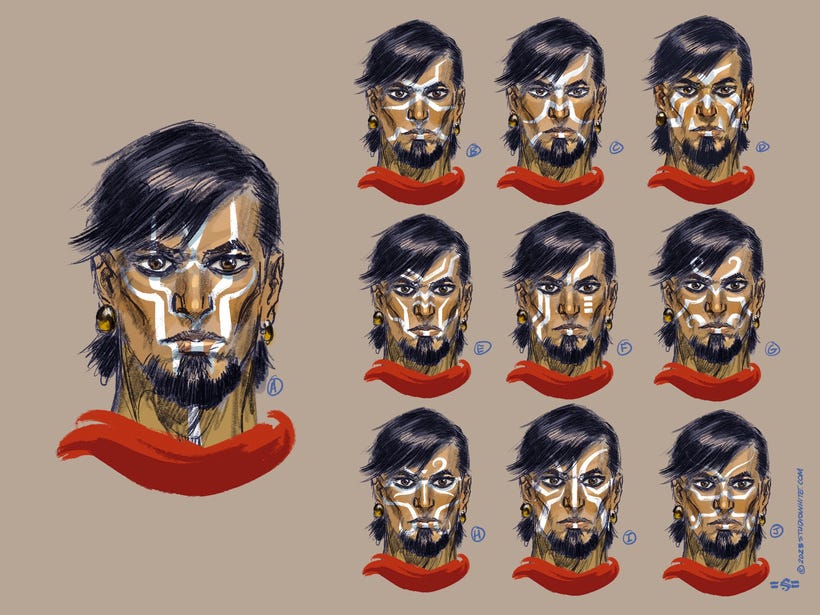
Zal Kragson goes through a change that will mark him as cursed. I wanted to make the brand on his face easy to illustrate and yet interesting. This was no easy task and I’m not sure I landed on anything I like. This indecision is not helpful but in the end I’ll probably go with my first image which happened to be D. It’s bold relatively easy to remember and doesn’t slip too far into some of the more Maori designs I was seeing when I started adding curved elements.
As for the rest of preproduction, a lot happens on-the-fly when something is needed, drawn on scrap pieces of paper--working things out as I go, before committing to the final art. It’s not as neat and orderly as I’d like it, but it gets me through the rough patches and doesn’t make anything too precious.
Sometimes you can fall in love with a drawing, a brushstroke or what-not, but it doesn’t serve you as well as you’d like if you look at it for what it is. I ran into that a few times throughout this project. I’ve even done a few things that I’m still questioning but I’m not sure if they’re good or bad; they’re just different. I hope that’s good, but I’m sure once I see it in print, I’ll kick myself for not just doing what’s been done before. That’s the thing about rules of layout and design; they work for a reason. Mess with them at your own peril.
=s=
Amazing work!