

DEAD LINES: A CLEAN APPROACH to Character Design
The MOST EFFECTIVE Approach to Building Out Your Portfolio

When it comes to character design in animation the DEAD LINE is the cleanest and most effective way to create character designs with. But it’s not without its challenges.
Because of the minimal approach, the emphasis is on very strong shape language and draftsmanship. Consistency from character to character to hold fast to a given style is also imperative. That is why it is incredibly difficult to get a job as a character designer. Why is that?
Prefer a downloadable PDF? Get it here.
A) Everyone wants to do the job
B) Most are not skilled enough to do the job
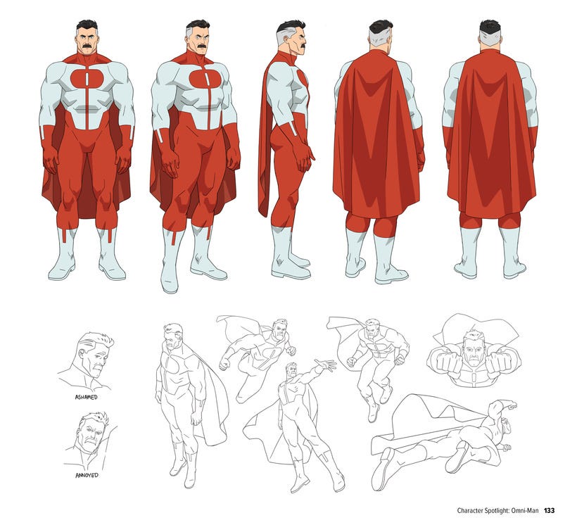
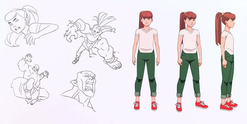
While these are mostly standing poses, or what is called a LINE UP for HEIGH RELATIONSHIP the job of the character designer will extend into emotes that also require consistency from expression to expression and from various angles. Rarely do you ever see a character straight on.
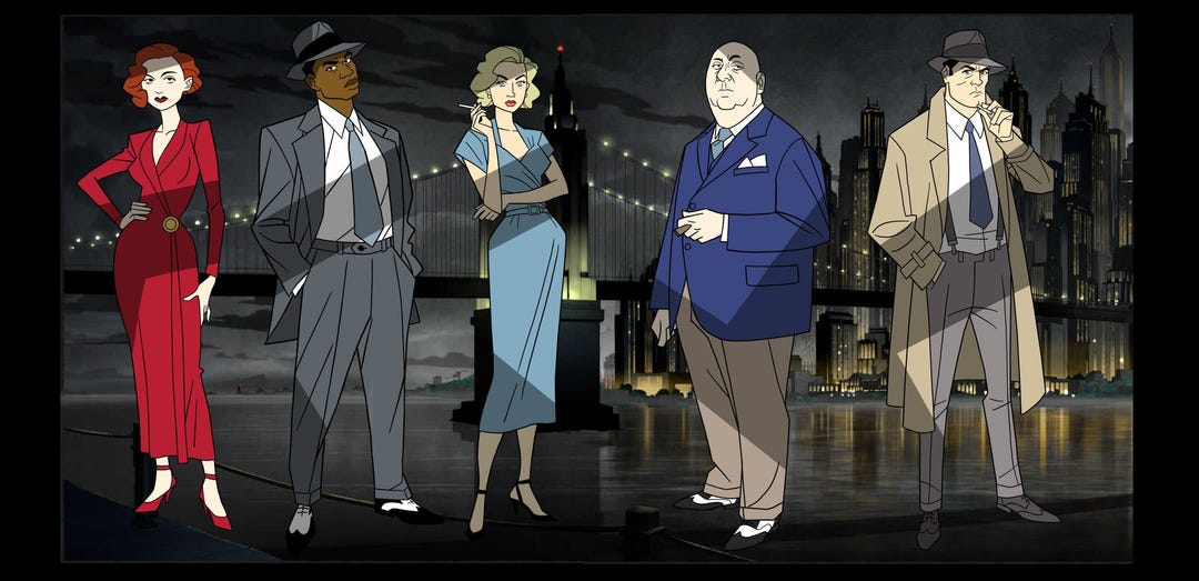
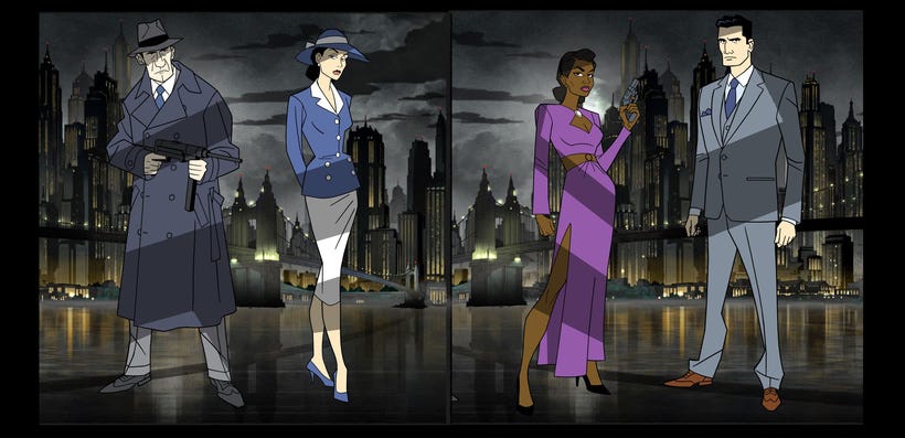
These prelim exploratory drawings were done by DUSTY ABELL for the new THE CAPED CRUSADER animated series. I’m not sure if they were used but if they weren’t I think someone missed the boat. Also note, many of these characters are 3-5 colors max. Another important thing when it comes to smartly designing characters for series animation. It puts less pressure on the ink and paint departments to be on model.
However, sometimes when translating existing characters from one medium to another it behooves one to distill everything down to not only it’s essential form but it’s essential personality. Take Guy Gardner for instance. I hadn’t seen that character since he was introduced back 30+ years ago...and I already remember how cantankerous Keith Giffen and Kevin Maguire made him.
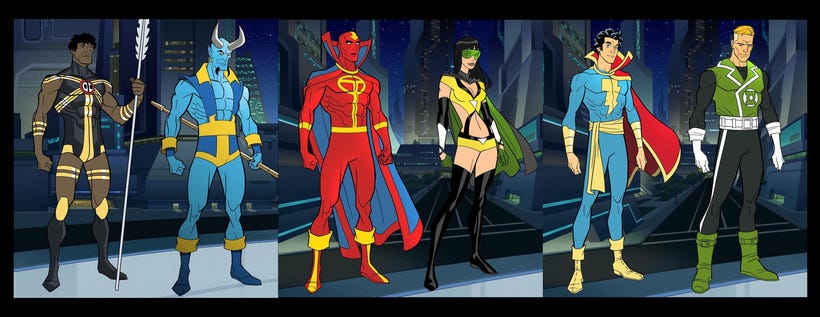
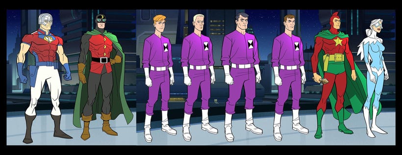
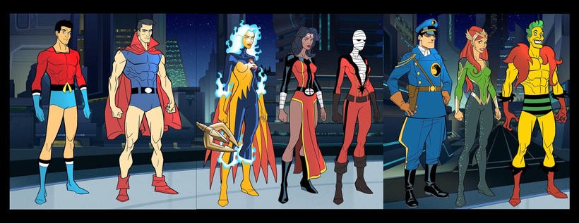
Another challenge (no pun intended) is capturing the uniqueness of the CHALLENGERS OF THE UNKNOWN. Very simple uniforms but they still have to stand out from one another. I don’t remember their names but their hair color and cut is distinct, as are their faces. However the second and fourth body types are the fairly similar. There are limitations you will run up against and it’ll feel like your hands are tied which will require you to pull out ALL THE STOPS.
In many cases this is why drawing from life is so important. Recognizing the characters that walk among us and pushing that envelope will build up your mental library for you to recall later. I like playing a game where I try to guess what PERSONALITY TYPE someone has based on their shoes. Shoes tell a lot about a person, but in character design that’s one of the least important things. More emphasis is put on the head and upper torso. But as actor’s, when you literally put on YOUR CHARACTER’s shoes, you can’t help but feel a significant change.
One disappointing thing I find in character design, especially for animation, is the lack of body types for women. On average their adornments and hair styling say the most about their character. And while I prefer a certain body type and look, for females that I find attractive I do believe more could be done to push beyond the generic aspirations. I’m not all about “Inclusion for Inclusion” sake, but more about “Let’s make things interesting and not ALWAYS retread the same paths.”
And no, I’m not throwing shade on Dusty Abell. He created what would be on-model characters that are translated from the comics. I just used this last example to make a point, more than to say he did anything wrong.
Going a little more in-depth, here’s COREY WALKER’s work on INVINCIBLE.
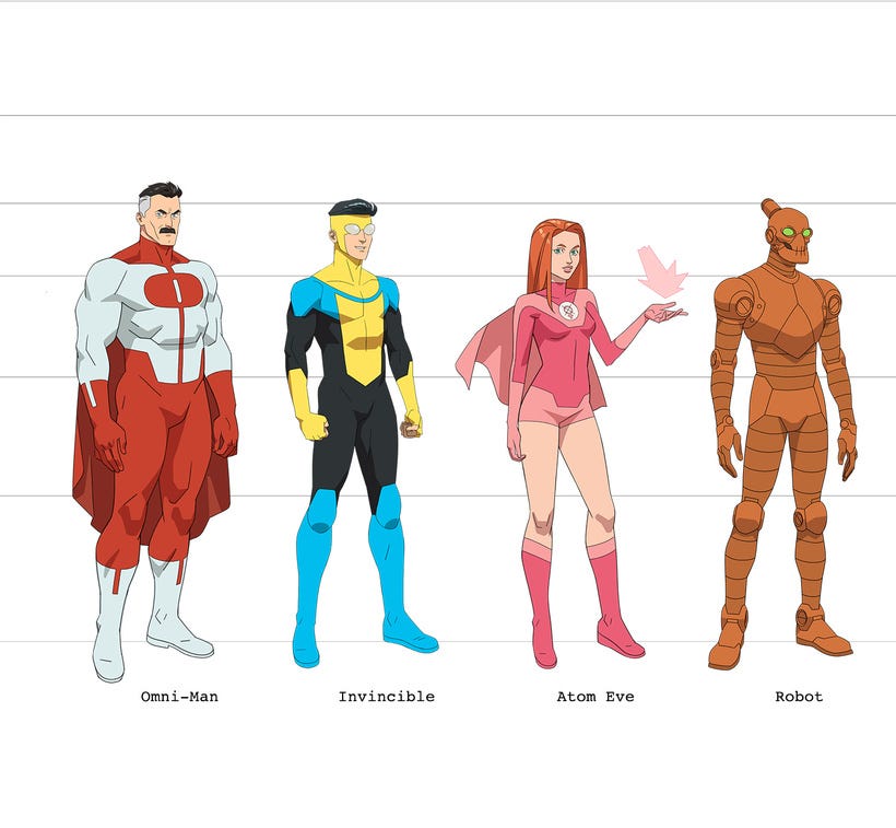
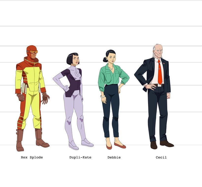
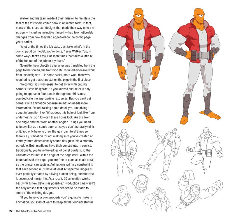
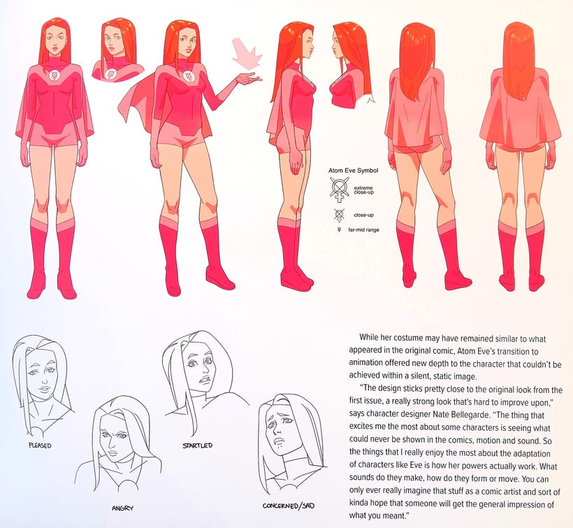
As you can see, though a different style, and a different series there is very little that dictates the very style of the show, and yet it is inherently different. I’ve only dabbled with this approach a little bit on various projects.
As you may have seen from previous posts here, I’ve tried to push the body types as much as I could. It’s a great exercise and I hope to keep my steel sharp for the next time I sit down to do this.
=s=