

The SECRET to STORYBOARDING CAMERA MOVEMENT Like a Pro
Push, Pull, Zoom: How I Indicate Camera Moves in Storyboards

If you’re like most people, you prefer to learn visually by watching a video of someone actually demonstrating what they are teaching. However, I also realize there are those out there who prefer written articles over video tutorials. But if you’re like me, you would love to have both. A video from which you can watch and learn, as well as a written article that highlights all of the important moments from the video that you can keep as a quick reference guide.
That’s why I’ve decided to turn some of my more popular videos from our Beyond The Process YouTube channel into written articles. Perhaps you’ve already watched the videos, but have forgotten most of the material of which I spoke. Well, my hope is this article will be a good refresher for you. Enjoy.
When you’re storyboarding, it’s not enough to draw nice poses and compositions. If you can’t clearly indicate how the camera moves, you’re leaving the director, DP, and crew guessing—and that’s where miscommunication (and expensive reshoots) start.
In this article, I’m breaking down four foundational camera moves I use constantly in my boards:
Push in (dolly in)
Pull back (dolly out)
Zoom in / zoom out
Dolly zoom
I’ll walk you through what each move does emotionally, how it’s achieved technically, and—most importantly—how I indicate it clearly in my storyboards. This is part one in a larger series where I’ll eventually cover almost every shot type we use in visual storytelling.
You can watch the full video version of this breakdown here:
Prefer a downloadable PDF? Get it here.
The Push In (Dolly In): Moving Toward the Subject
The push in (also called a dolly in) happens when the camera physically moves forward toward the subject. That’s key: the camera is moving through space, not just changing focal length.
We might achieve this with:
A dolly on tracks
A Steadicam
A crane or jib arm
Or any rig that physically advances the camera toward the subject
Because the camera is moving, the perspective and depth change. Foreground and background elements shift relative to each other, and that creates a very natural, immersive feeling for the viewer. It mimics how we move in real life: if we want to see something closer, we walk toward it.
What a Push In Does Emotionally
Here’s how I tend to use a push in:
To align the audience with a character’s thought process or emotional state
To intensify a moment as we get closer
To focus attention on something important in the frame
For instance, in Raiders of the Lost Ark, the camera slowly pushes in on Indy as he calculates the idol’s weight. The move pulls us into his mindset—you can watch that breakdown in the video here:

In The Godfather, a push in on Michael as he wrestles with the decision to kill two men pulls us into his internal conflict:

And in Casino, a push in past Ginger to Lester’s car, and then into Ginger’s hair bun, focuses our attention on exactly what matters in that moment:

How I Indicate a Push In in My Storyboards
Everything I’m about to describe hinges on one principle: use arrows clearly and consistently.
My preferred method has two main variations:
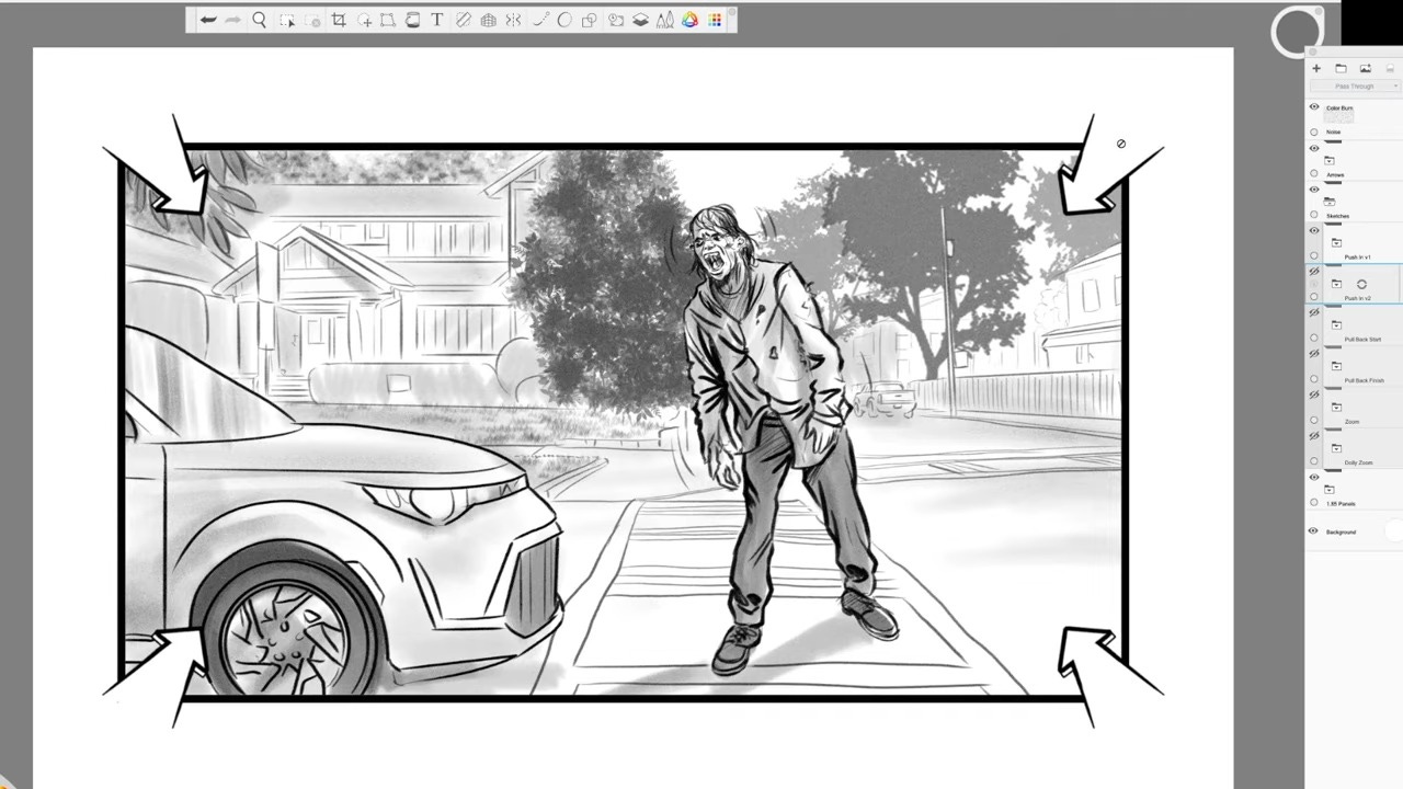
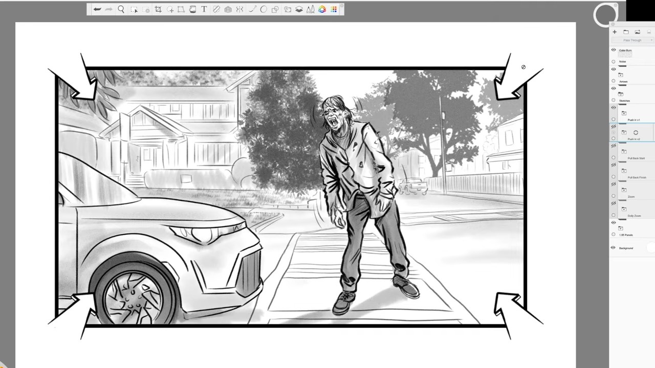
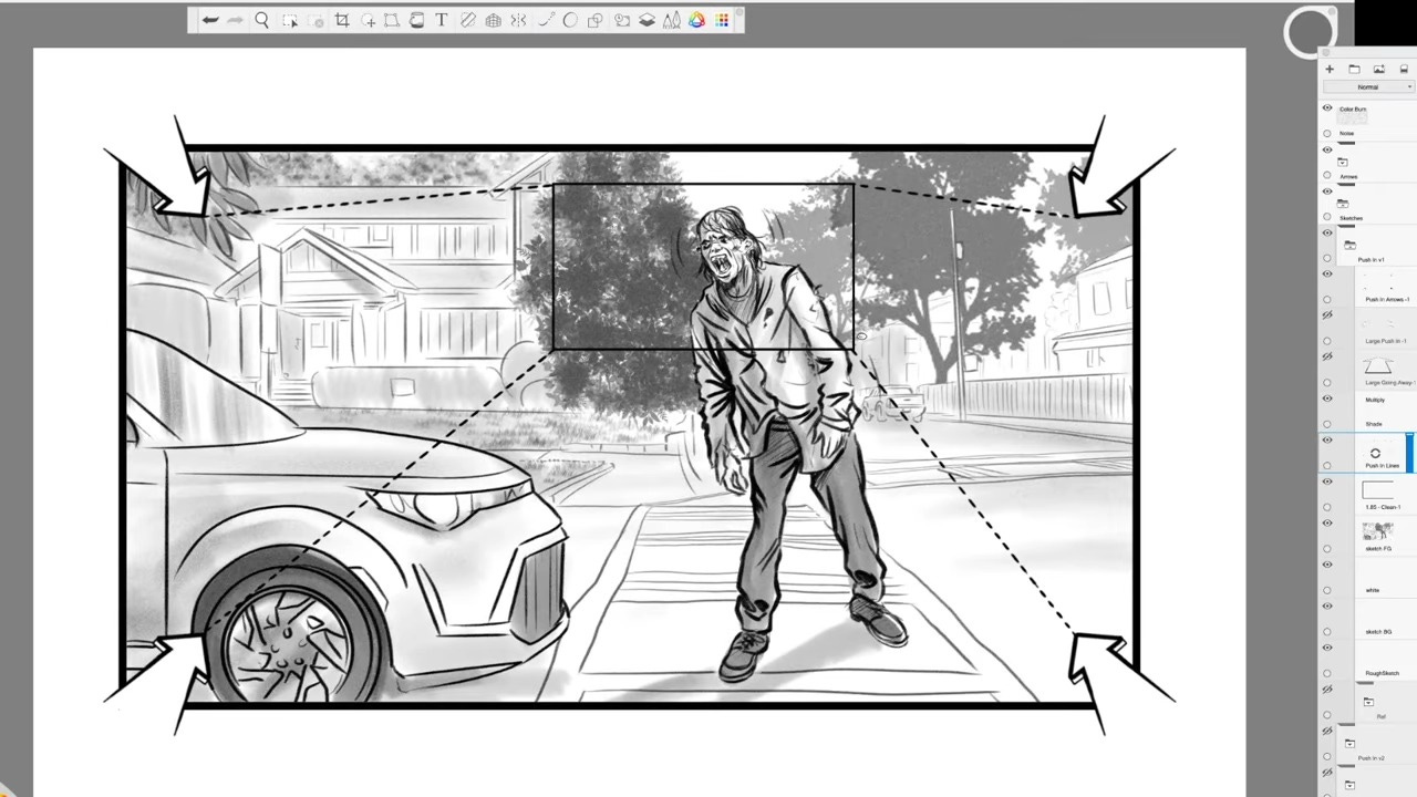
Method 1: Single frame with corner arrows
I place arrows in all four corners of the panel pointing inward.
This tells everyone: the camera is moving forward toward the subject.
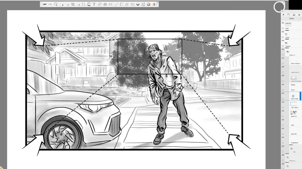
Variation A: Inner rectangle for final composition
Inside the frame, I draw a 16:9 rectangle representing the final composition.
I connect each corner arrow to the inner rectangle with dotted lines.
This clarifies both the starting and ending positions of the move.
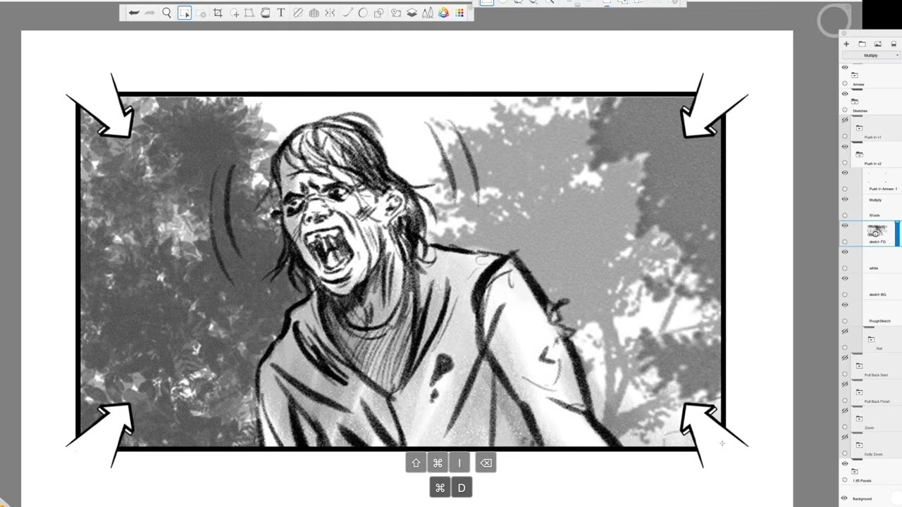
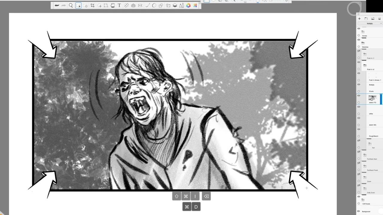
Variation B: Two panels (1A and 1B)
I duplicate the initial frame.
I scale up the drawing in the second panel to show the closer end position.
I clean up any linework that spills outside the frame.
I label them 1A and 1B, not 1 and 2, to make it crystal clear this is one continuous shot, not two setups.
Other artists prefer:
Two large perspective arrows on either side of the frame, pointing inward
Or one large perspective arrow from the bottom, pointing into the frame
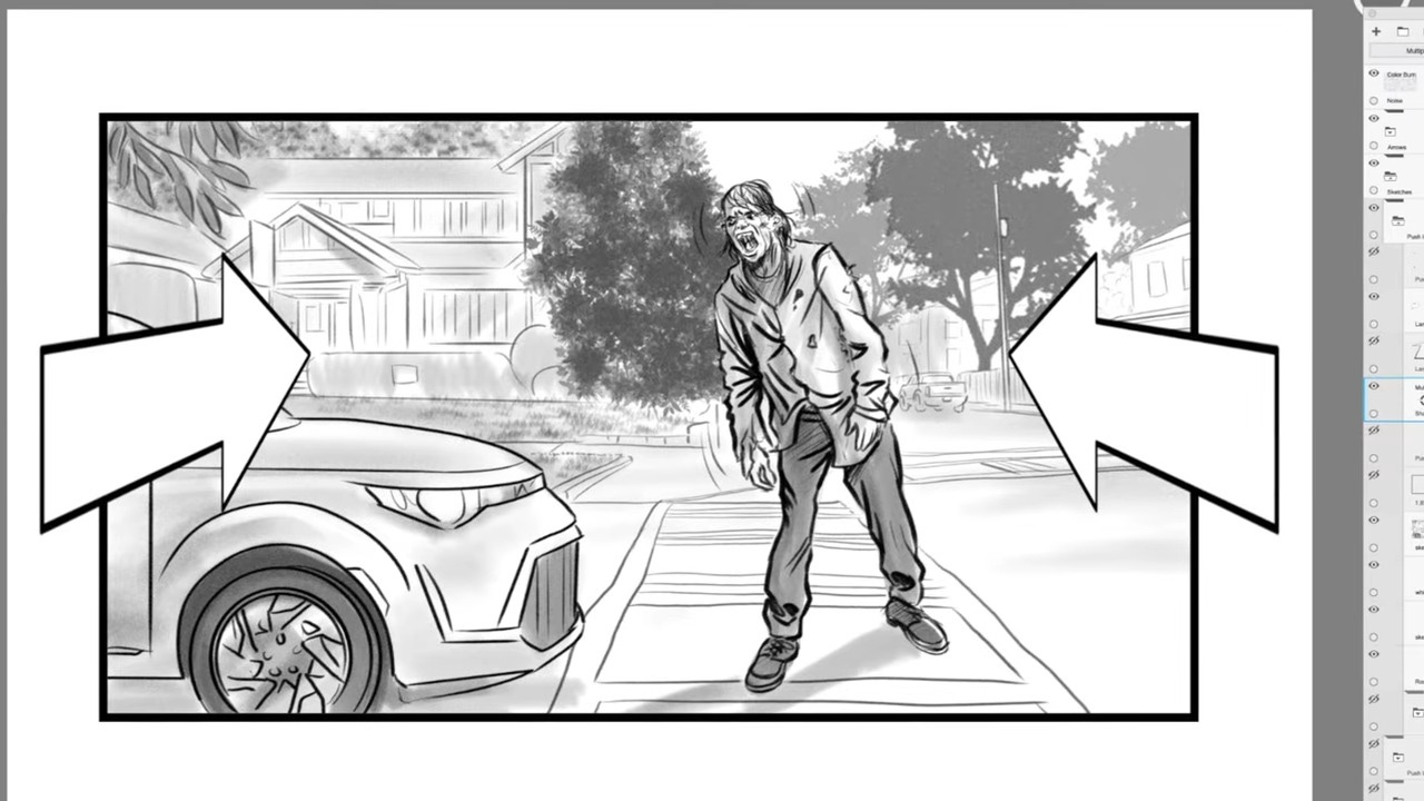
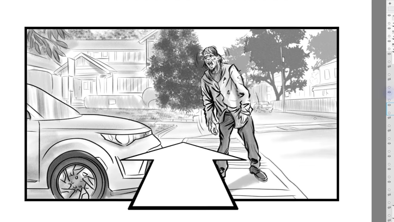
Those are valid, but I personally find four corner arrows + clear labeling leaves the least room for misinterpretation.
The Pull Back (Dolly Out): Revealing Space and Creating Distance
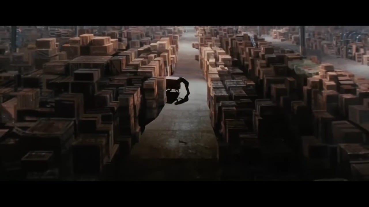
The pull back (or dolly out) is essentially the inverse of the push in. We start closer to the subject and move the camera backward, revealing more of the environment.
What a Pull Back Does Emotionally
I actually find the pull back has more varied uses than the push in. Here are three core ones I rely on:
Emotional distancing
Pulling away can create a sense of detachment or loneliness.
It’s great for ending an intimate moment or showing a character becoming isolated.
Revealing hidden information
As we move back, we can reveal new elements in the scene.
This can create surprise, add context, or completely reframe the situation.
Showing scale
Pulling back can reveal the true scale of a location or situation.
It’s perfect for showing a character’s smallness in a vast environment or the grandeur of a landscape.
How I Indicate a Pull Back in Storyboards
Technically, we still rely on arrows—but there’s one important difference from the push in.
Because a pull back starts close and moves out, it’s very hard to show both the starting and ending compositions in one frame. So:
I always plan for two panels for a pull back.
My methods:
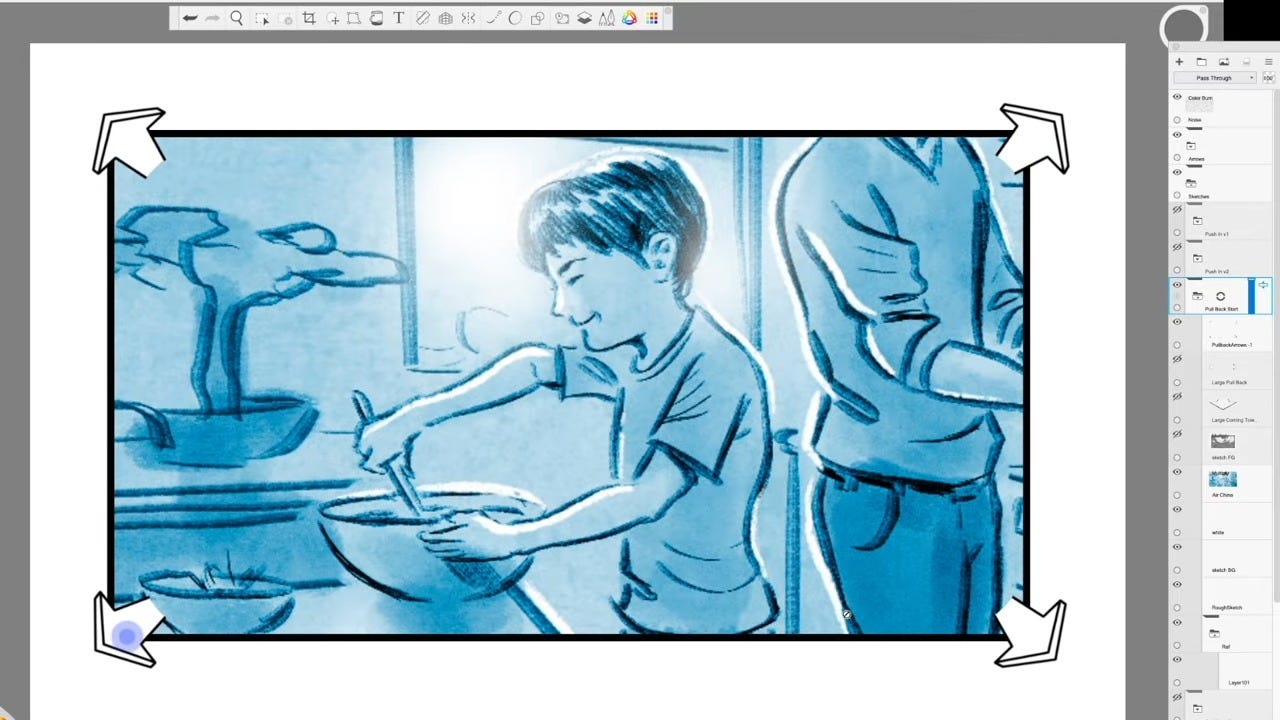
Method 1: Four corner arrows pointing out
I place arrows on all four corners of the panel, pointing outwards.
This indicates the camera is moving backward away from the subject.
Alternate methods
Two perspective arrows on either side, pointing out of the frame
One large perspective arrow at the bottom, pointing out of the frame
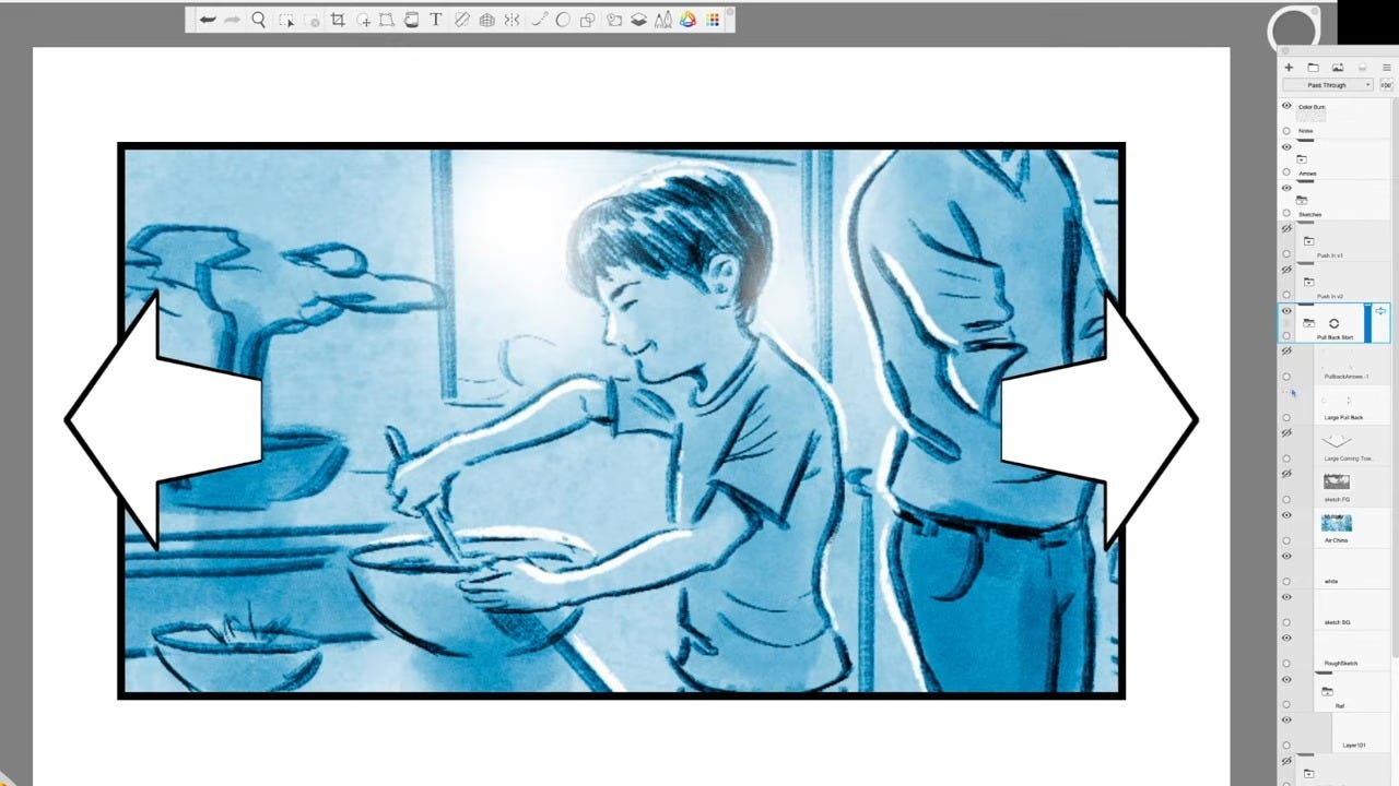
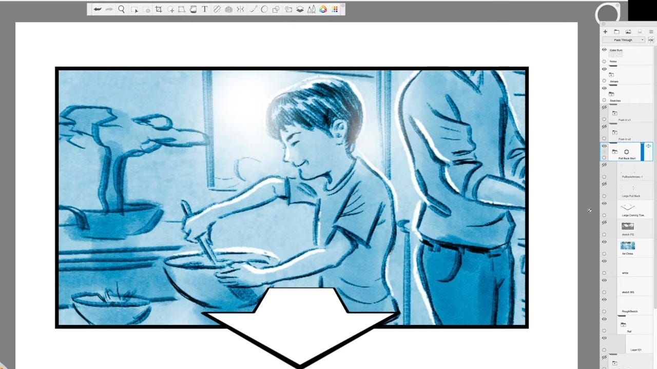
The reason I avoid relying on a single large arrow is simple: it can be mistaken for subject movement, as if the character is walking toward camera. Four corner arrows make it obvious that the camera, not the subject, is moving.
My Time-Saving Trick for Pull Backs
I promised a way to save time, and I use this constantly.
Whenever I know a pull back will require two panels:
I draw the second panel first—the wide, pulled-back composition.
Then I duplicate that panel and zoom in on the area that will be the starting close shot.
That zoomed-in version becomes panel 1A; the original wide becomes 1B.
This way, I only have to solve the composition once.
Zoom In / Zoom Out: Same Frame, Different Lens
Now let’s talk about zooms, and why they’re not the same thing as dolly moves.
With a zoom, the camera stays completely stationary. We’re not moving through space at all. Instead, we’re changing the focal length of the lens.
That means:
The perspective stays the same
Foreground and background relationships remain constant
We’re simply magnifying the image
This is why zooms feel less natural. Our eyes can’t zoom—they can only move closer or use tools like binoculars. A telephoto zoom can also:
Compress and flatten the image
Seem to “bring the background forward”
Reduce depth and sometimes blur the background, depending on aperture and lens length
In contrast to a push in (where we feel like we’re moving toward the character), a zoom in often feels like the character is coming toward us.
When I Use Zooms
Historically, zooms were heavily used in the 60s and 70s, partly because they were cheaper and easier than elaborate dolly moves. Today, with drones, gimbals, and affordable rigs, we can get beautiful push-ins and pull backs without massive budgets.
So why still use zooms?
A subtle zoom can add just enough movement to bring life to a static shot and build tension.
A crash zoom—an extremely fast zoom in or out (often under a second)—can:
Heighten comedic beats
Snap the viewer’s focus to a specific detail
Emphasize a dramatic reaction
Quentin Tarantino uses crash zooms extensively, drawing on that 1970s aesthetic.
How I Indicate Zooms in Storyboards
This is where some people are disappointed: I indicate zooms almost exactly the same way as dolly moves—with arrows and multiple panels.
The key difference is in the annotation:
For a zoom in:
I show a closer second frame, sometimes with a slightly enlarged and softened background to suggest the telephoto feel.
I write a clear note: “ZOOM IN,” not “PUSH IN.”
For a zoom out:
Same logic, but in reverse.
Again, I rely on clear labeling: “ZOOM OUT.”
The visual indication alone can’t always tell the crew whether it’s a physical move or a lens change, so the written note is crucial.
The Dolly Zoom: When Push and Zoom Have a Baby
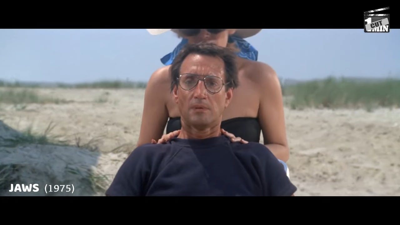
Finally, let’s talk about the dolly zoom (also referred to as a “zolly’)—that wonderfully disorienting shot made famous in films like Vertigo and Jaws.
A dolly zoom happens when:
The camera moves toward or away from the subject (on a dolly),
While the lens zooms in the opposite direction.
So, for example:
Camera moves in, lens zooms out
Or camera moves out, lens zooms in
The result is a strange, unsettling effect where the subject stays roughly the same size, but the background warps—either expanding or collapsing around them.
Why Use a Dolly Zoom?
I use this very sparingly, and I recommend you do the same. It’s powerful but easy to overdo. It’s great for:
Creating unease or disorientation
Visualizing a character’s sudden realization or emotional shock
Simulating vertigo or the feeling that the world is closing in or expanding
Emphasizing a critical dramatic moment by distorting the environment around the character
How I Indicate a Dolly Zoom in Storyboards
To indicate a dolly zoom, I combine the methods I use for pushes/pulls and zooms:
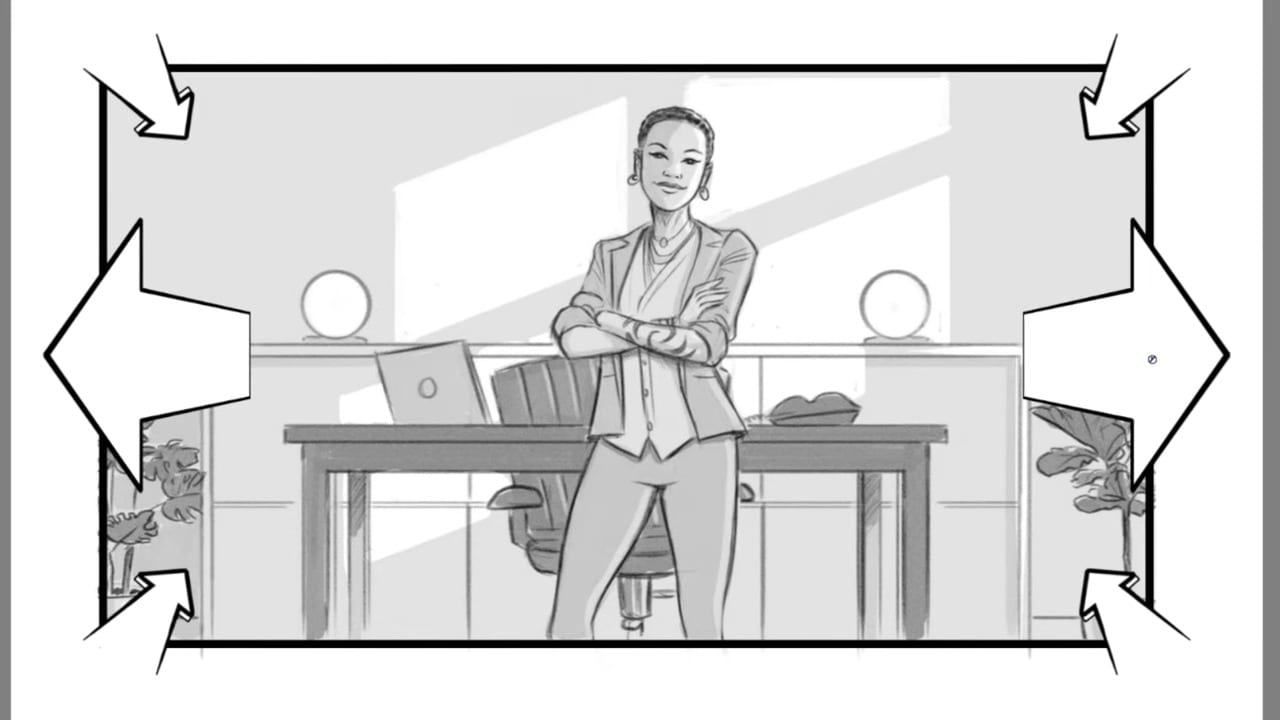
I use two sets of arrows with opposing directions. For example:
If the camera is moving in while the lens is zooming out:
I place four corner arrows pointing inward (push in).
I add two perspective arrows on either side pointing outward (zoom out).
I then write a clear description beside or below the frame, something like:
“DOLLY IN + ZOOM OUT (DOLLY ZOOM)”
The combination of arrows plus written note makes it unambiguous to anyone reading the boards.
Key Technical Tips (at a Glance)
Use arrows consistently:
Push in / dolly in: arrows pointing inward
Pull back / dolly out: arrows pointing outward
Zooms: same arrows, but always label as zoom, not push/pull
When a move has a clear start and end:
Use two panels, labeled 1A, 1B for one continuous shot
Or a single panel + inner rectangle for the end composition
To avoid redrawing:
For pull backs, draw the wide shot first, then duplicate and zoom in for the close start
To prevent confusion:
Avoid using a single large arrow if it could be mistaken for subject movement
Use four corner arrows when clarity is critical
For complex moves like dolly zooms:
Combine opposing arrows (push + zoom)
Always add a written description of the move
These fundamentals—push in, pull back, zoom, and dolly zoom—are the backbone of how I communicate camera movement in my boards. Mastering how to indicate them clearly will make you a better collaborator and a far more valuable storyboard artist.
I’ll be continuing this series with more shot types and techniques in future installments, so if you’re interested in diving deeper into the language of visual storytelling, stay tuned.
-Lance-