

REFERENCE: Who's in the Driver's Seat?
Does the idea drive the reference or does the reference drive the idea?

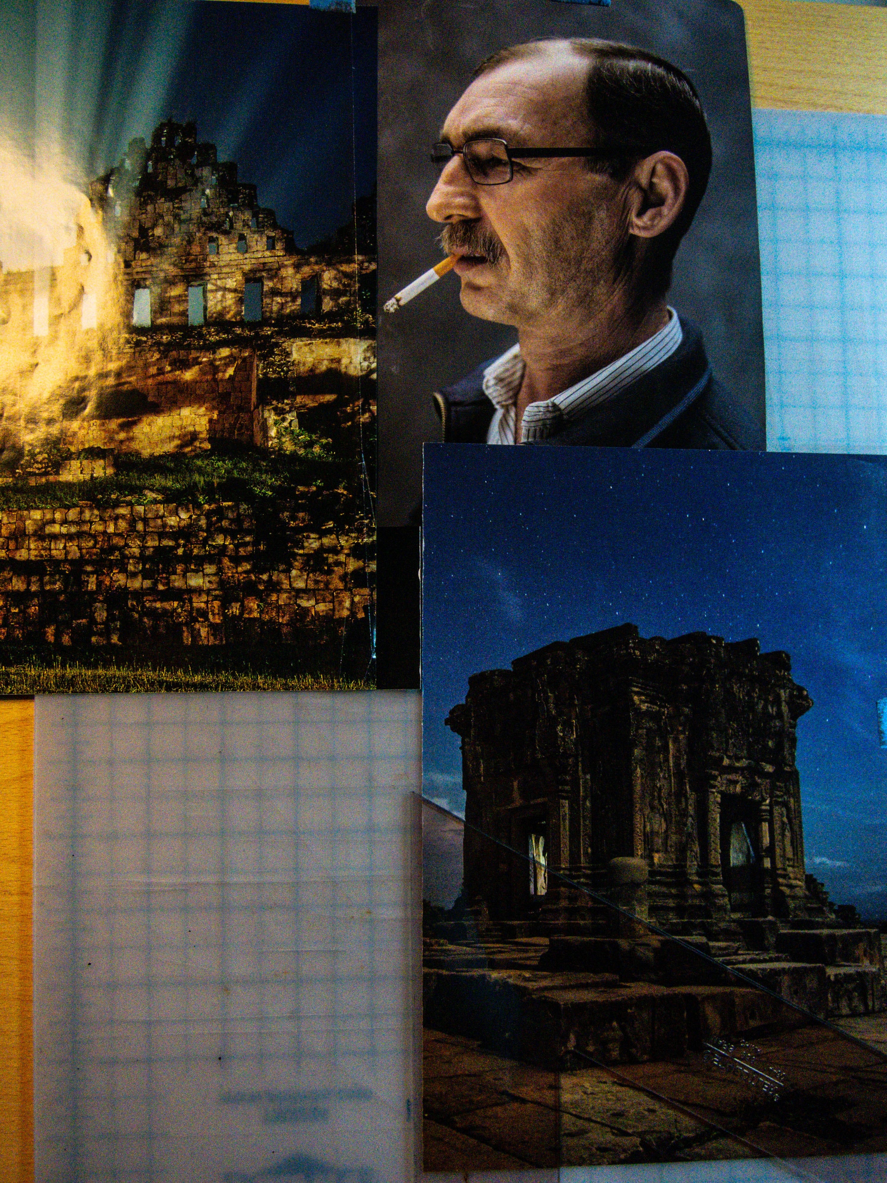
It's a fair question. And knowing it from the outset will help you understand the outcome. Unlike many artists early in their career I have what is a called a MORGUE FILE. It's not as grave as it sounds...er...I mean, it's where I keep the bodies...OF REFERENCE! :)
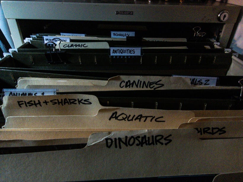
I've had one since I was a kid. But I've learned over the years how to catalogue all the clipped magazines and images I've pulled from sources over the year in a way that makes most sense to me. With the birth of Google Images, Flickr, Pinterest and other image sourcing sites I've got a lot at my disposal.
For this article I've done a couple different approaches. The first is pretty straight forward and the second is a little more involved. I was rifling through my morgue file and happened upon a series of images that GAVE ME AN IDEA…
Prefer a downloadable PDF? Get it here.
This is an important distinction.
Reference can be a strong catalyst to drive you toward an idea, to make you associate whatever is going in your head on any given day. I picked three images because I thought it'd be interesting to draw a night scene of John Constantine a character from HELLBLAZER (DC/Vertigo Comics). I used to have a lot of Hellblazer books, but I sold a complete run for very little money. So, I didn't have a point of reference or even remember the character all that much. A quick search on Wikipedia helped some and the image started to fully form in my head.
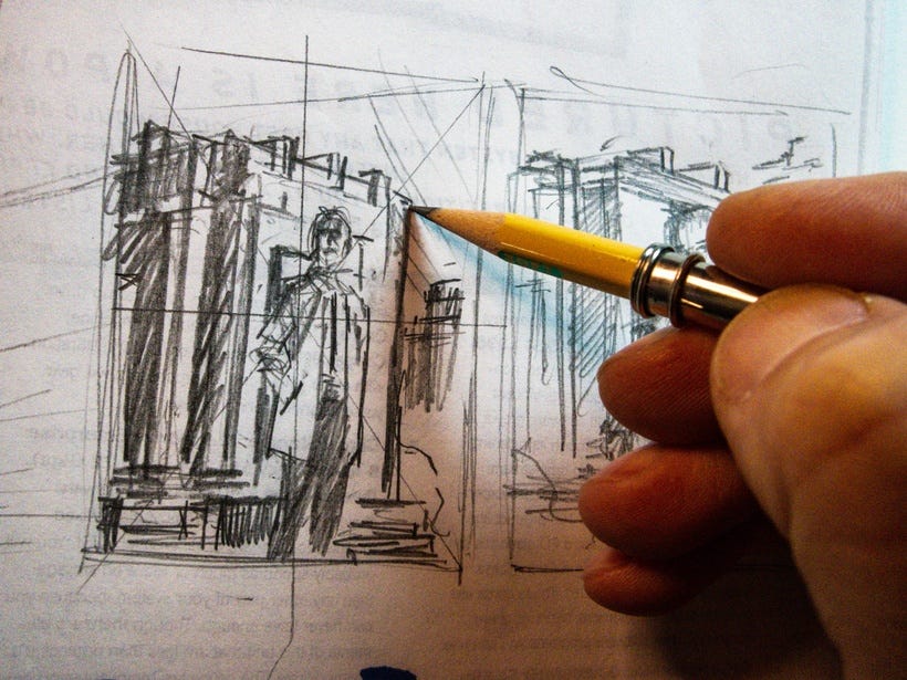
I chose a slight up angle, because I wanted to give Constantine a little more power while standing next to an ancient monolith. I figured out where I wanted him to stand in relation to it as well and what the rest of the scene would look like. Ideally, I just wanted to keep it simple.
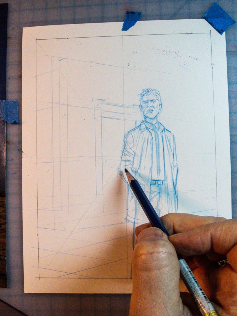
From here I roughed in the character with my Col-Erase Indigo Blue pencil. I like these pencils for layout because they erase easy, are clear to see, and if I'm scanning a piece that has ink the blue drops away without adding any additional shadow. I'll often eyeball the overall shape of the area that the reference will occupy. In this case the reference is almost close to the same size and position.
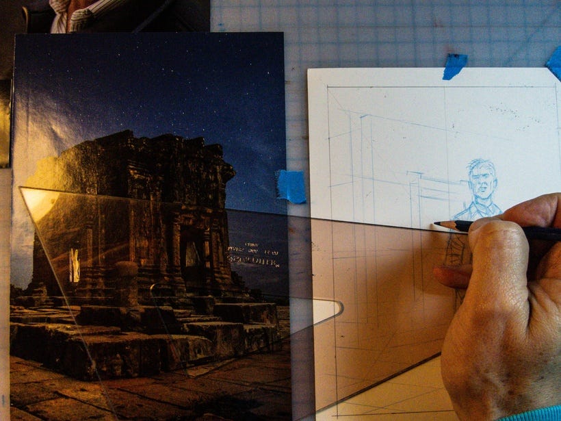
If you want to transfer the same perspective lines of your reference, set the piece up next to your art and use a straight edge. This works mostly because I was downscaling the image for my piece. If I wanted to enlarge it, I might set it on the right size of the paper and draw the perspective lines FROM the piece. Looking at my TRIANGLE you can see what I mean almost quite literally. The triangle is similarly receding to it's furthest point (under my hand). If the reference was on the other side of the paper, I'd be drawing away from my hand, and the perspective lines would be scaling. Does that make sense?
Granted if your reference is only slightly bigger or smaller, then trace it with tracing paper and use a Lightbox or Window to transfer your drawing.
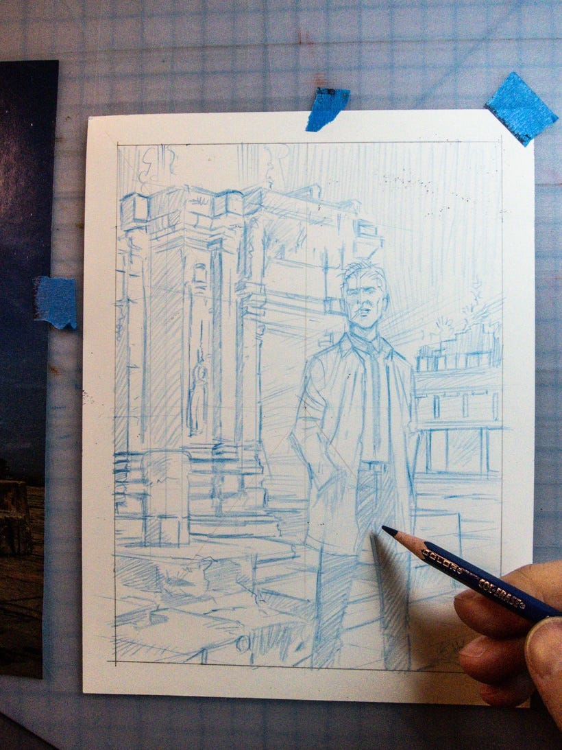
As you can see, the piece utilizes elements from two of the images above but in different configurations. One was more or less a DIRECT COPY, adapted to my idea of pulling light from the night sky. The other reference was used as an INDIRECT COPY for lighting and shape. The man with the cigarette helped a little for my rendition for Constantine.
BUT WAIT...THERE'S MORE.
I liked the guy with the cigarette so much I thought it would be a good idea to see if I could enhance my Photoshop skills and get a brush set down that could give me a certain look while letting me explore STYLIZED REALISM.
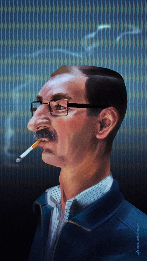
The guy struck me as some sort of Eastern Bloc agent back in the day. I stretched out his neck some, added more head height and pushed some of his features a little without going full-on caricature. In the end I was able to match the lighting as well which was a great exercise. By throwing in wallpaper, I was able to push an element of design and make it feel a little esoteric.
As you can see each piece uses reference differently. I would say that the reference had a STRONG DRIVING factor and dictated a lot of the outcome of the pieces.
Reference can be used also as a SUPPORTIVE element, too. It all depends on HOW MUCH or HOW LITTLE reference you need to actually do the drawing. Your skills will determine much of that. While I am a capable draftsman, I find when I paint, I absolutely need a lot of reference. Mainly because:
I have little confidence in my painting ability to convince the viewer of what they're looking at is solid and real
I lose a lot of my drawing when I pile on the paint
Shapes are not as clear and color transitions can get muddy without a guide
Preparation is the key to success
But say you have strong drawing skills, but you need the surrounding elements to feel competent because you're not as good at drawing buildings or cars. Remember whatever reference you choose should serve the story of the illustration. Whatever your focal point is, should be the area of concentration. Everything else should support that as well as convince the viewer that these cars/buildings/horses/etc. are of the same level of draftsmanship and quality as the elements that you are capable of rendering.
I once illustrated comic samples and showed an editor and the first thing he said was: "Looks like you had reference for that panel. Why didn't you use more reference elsewhere?"
And sadly, I did not have an answer only lame excuses.
Do yourself a favor and try a few ideas out.
1] Find reference and build an illustration around it.
2] Create an illustration based on reference you shoot entirely on your own from thumbnails
3] Create an illustration in your style and find reference that you can adapt to your style that supports the work.
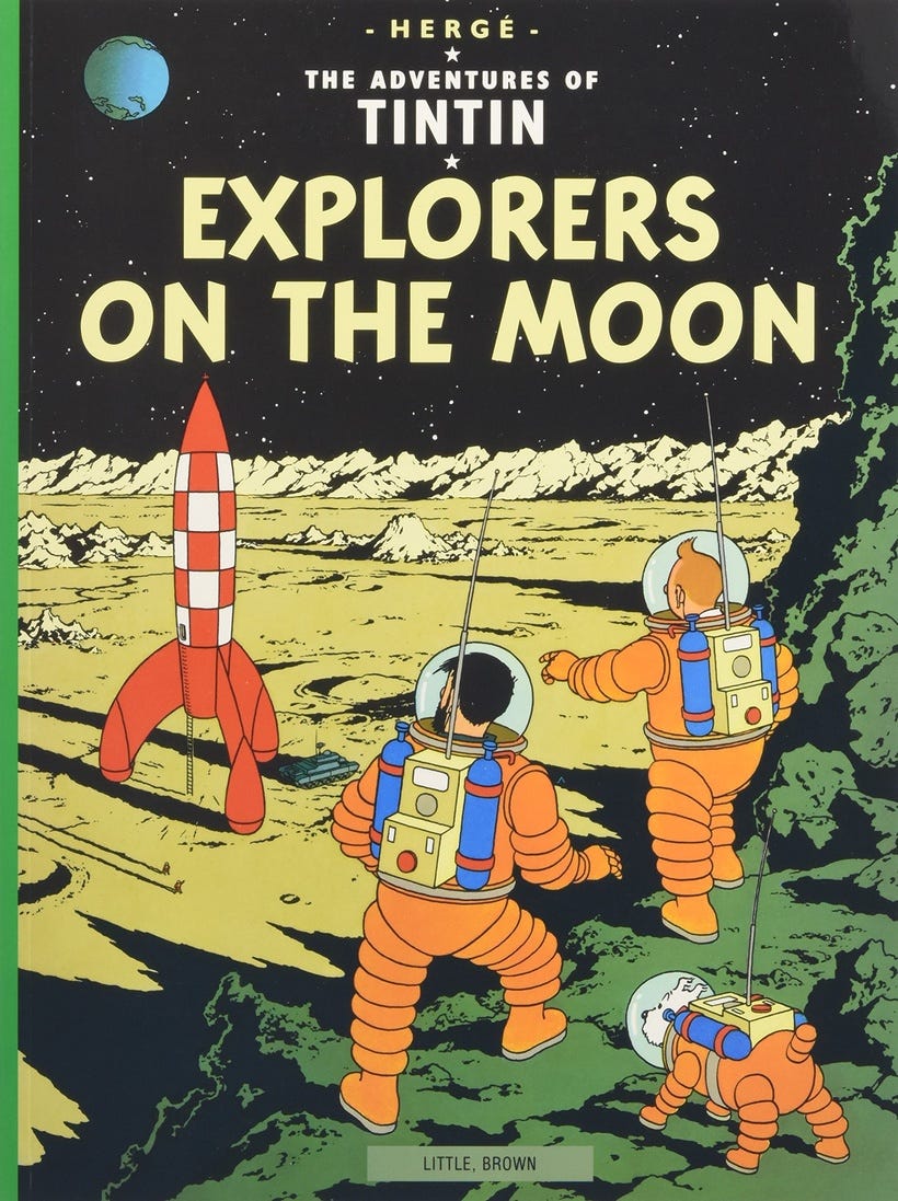
If you're familiar with TINTIN, Herge's character, you'll notice that even though it's a cartoony style they still used reference to help ground the hero. Here's one of my favorite images.
=s=