

STORYTELLING: Breaking Down Comics Pt.2
A Comic Page is an Exercise in DESIGN + NARRATIVE

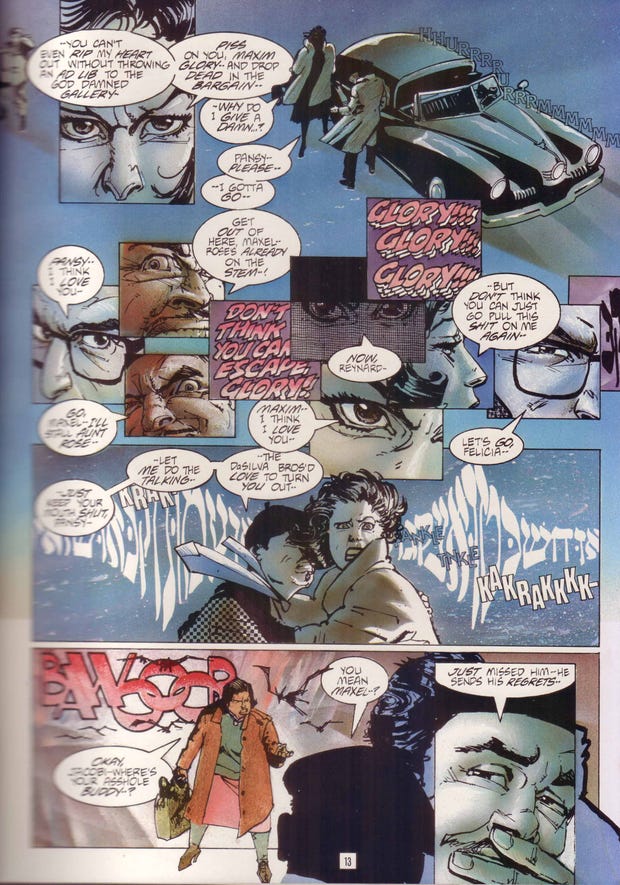
COMICS IS A VISUAL MEDIUM is usually the first thing you will hear when a professional creator describes the trade.
But without words to string moments and images together you're also missing out on a layer of the comic book experience. Handling the words and lettering can be as equally invigorating to storytelling as any figure or environment. That's why it's essential to understand the POWER OF GRAPHIC DESIGN in storytelling.
Prefer a downloadable PDF? Get it here.
Take this page of AMERICAN FLAGG, written and drawn by HOWARD CHAYKIN. Because he was fully in charge of the story (writing, art, lettering), he could control how the message was conveyed. He directs the eye and the flow of story using graphics, illustration and typography. Outside of advertising what other medium does this to such granularity?
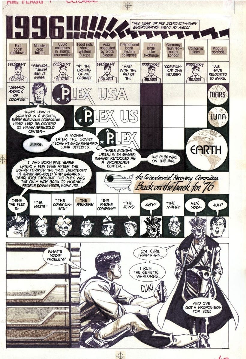
This is what makes comics UNIQUE. It's like having a secret weapon that will hold your audiences attention as they connect with the ICONS and SHAPES, and puzzle out the larger message and story. It's about the DIRECTING THE EYE, CREATING FLOW and TRANSITIONS from panel-to-panel, scene-to-scene and page-to-page.
I believe it was TOLSTOY who said: "Transitions are the single-most important thing in writing." (Or something like that)
Making cool art is great, but everything should be there, should serve the story and not be wasteful in its use.
As a whole, it's good practice to lay out your comics in two page spreads. Your eyes will take in most of that information as you turn the page. The cohesiveness of those spreads will leave an indelible mark on your psyche that should be quantified by the end of the story.
As a for instance, check out the next four pages of J.H. WILLIAMS' Batgirl comic. It's where the 2-page spread really was hammered home for me.
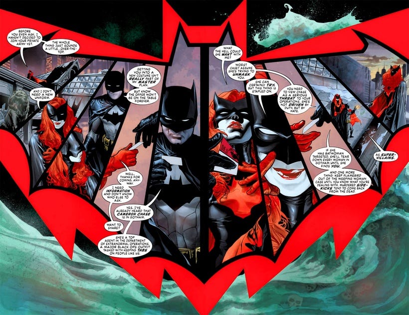
Now, granted, this is exceptional use of the 2-page spread and may not be right for every project, but look at the layering involved. Take the last image here, GRAPHIC ELEMENTS are simple reads--they stick in the mind easier. The RED BATGIRL EMBLEM encases BATMAN's EMBLEM giving it another level of meaning. Contrasting all this with beautiful but standard comic art, is the complimentary colored watercolor, the hand-painted medium with skulls snuck in there, surrounding the emblems. There's a lot of meta-stuff going on here, and audiences love that stuff.
As humans, we are driven to make sense of the world, to understand the unknown and decipher patterns. I say, as storytellers, give them something to chew on.
So, let's get back to HOWARD CHAYKIN for a moment.
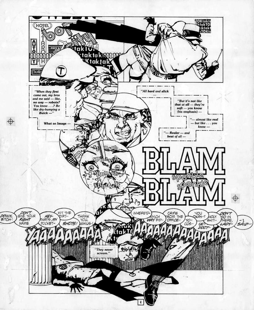
Even with the change in font he is trying to flavor the characters dialogue so it feels different. On one hand, it's a great way to push elements. I've seen it done for separate characters before and while interesting, can getting tiring to read after awhile. There's a fine line in these cases between making art and clarity. You want the reader to have a great experience, get involved, but not make them work for your story. I've heard from others that lettering should not be noticed.
Lettering that draws to much attention to itself is not good. Really, that depends a lot on what you're trying to say and if you can show differences that are subtle. Your mileage may vary, but it's worth keeping in mind.
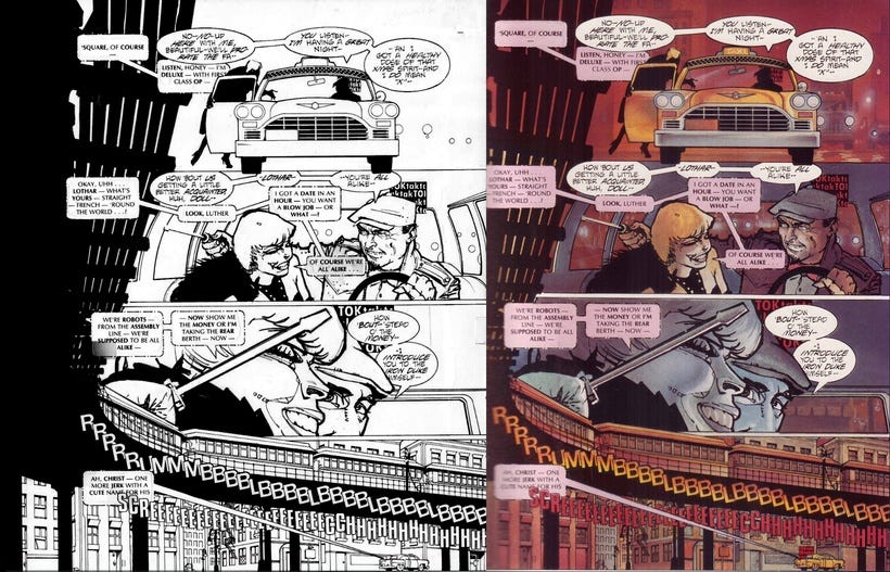
The example above also helps illustrate the role of color in a scene. At it's most basic the balance of WARM and COOL COLORS helps pull focus to what you want your viewer to see. Pushing and pulling VALUES and SATURATION can play an equally graphic part in this process. Chaykin, tended to paint his work on boards printed with the linework in blue and then used an acetate overlay with just the ink. Those would be sent to the printer's for separation...in case you were wondering.
Jim Steranko pushed comics in new directions, which was more of a reflection of the 1960s. He was looking at everything from fine art to illustration and fashion. It played well with his sensibilities and I would argue, started us on a path to look at comics as art and not just entertainment for kids.
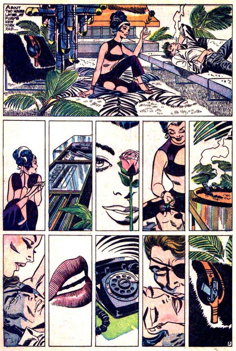
Close-ups of faces, lips, a phone and a gun holster, tell us a lot about this scene. These icons say a lot without words. In a different order they could easily mean something else. Not every panel needs to be fully rendered to get the message across. But it's worth noting, once you start down that path, keeping that DIALECT OF STORYTELLING is important.
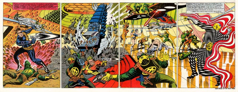
As Steranko's career continued, he began pushing his work further into Pop/Op Art. The Nick Fury pages below were mind-bending in an era where youth culture of music and drugs were the cause de rigeur. The results are fantastic, and they continued to influence creatives further on down the line. Even today, it seems there are still a few excellent examples of graphic storytelling that make you slap your head and say, "Why didn't I think of that?"
Like this piece below by Alvaro Martinez Bueno. The fact that artists outside of the U.S. are pushing comics in new fun ways tells me that they've been paying attention and because American Comics are a unique medium, we see it filtered through their culture and it seems fresh, again.
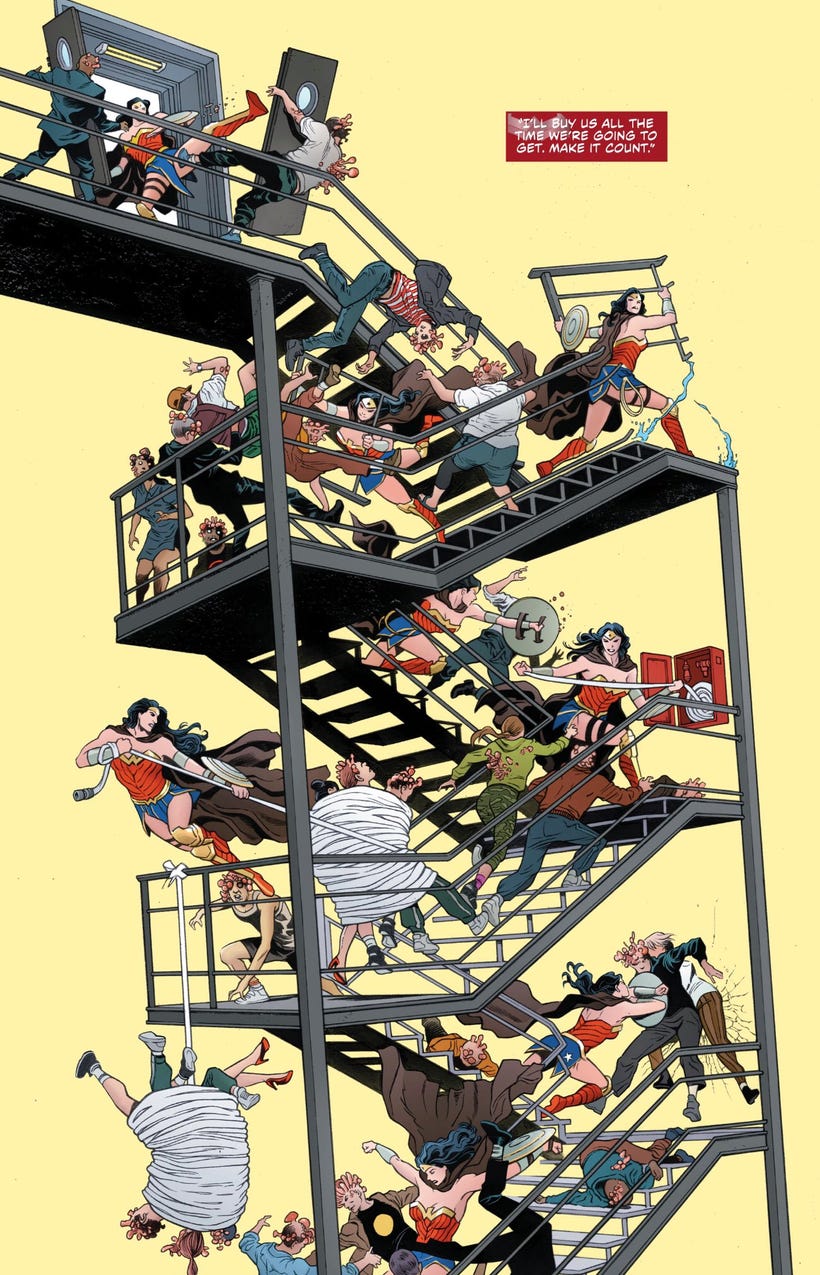
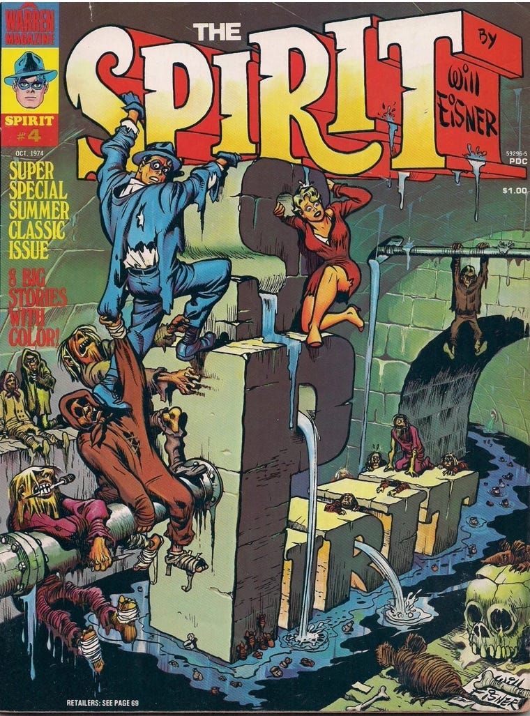
One could say, he's reaching even further back in time to the influence of The Godfather of Sequential Storytelling: Will Eisner. Look at most comics today and you can see how much more exciting these layouts are compared to the "storyboard" visuals that artists have leaned toward.
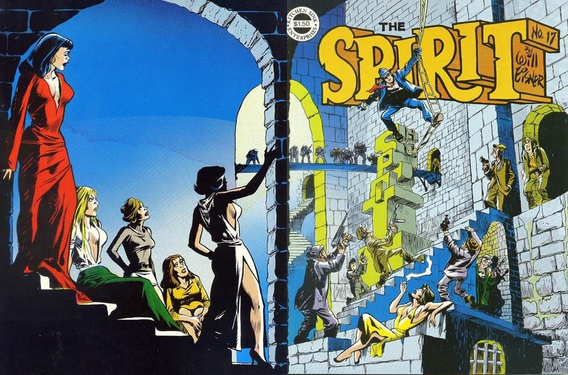
It's not to knock the artists creating comics in our modern times. Their influences have been mostly films and video games. They didn't grow up in an era where radio dramas filled your head with images and ideas. They don't have to invent as much because so much is being created. That's why, at least to my mind, derivative works are so rampant and more easily acceptable. It's both an art and commerce kind of thing. "What's it like?" and "Can I sell more of it if I position like what has gone before."
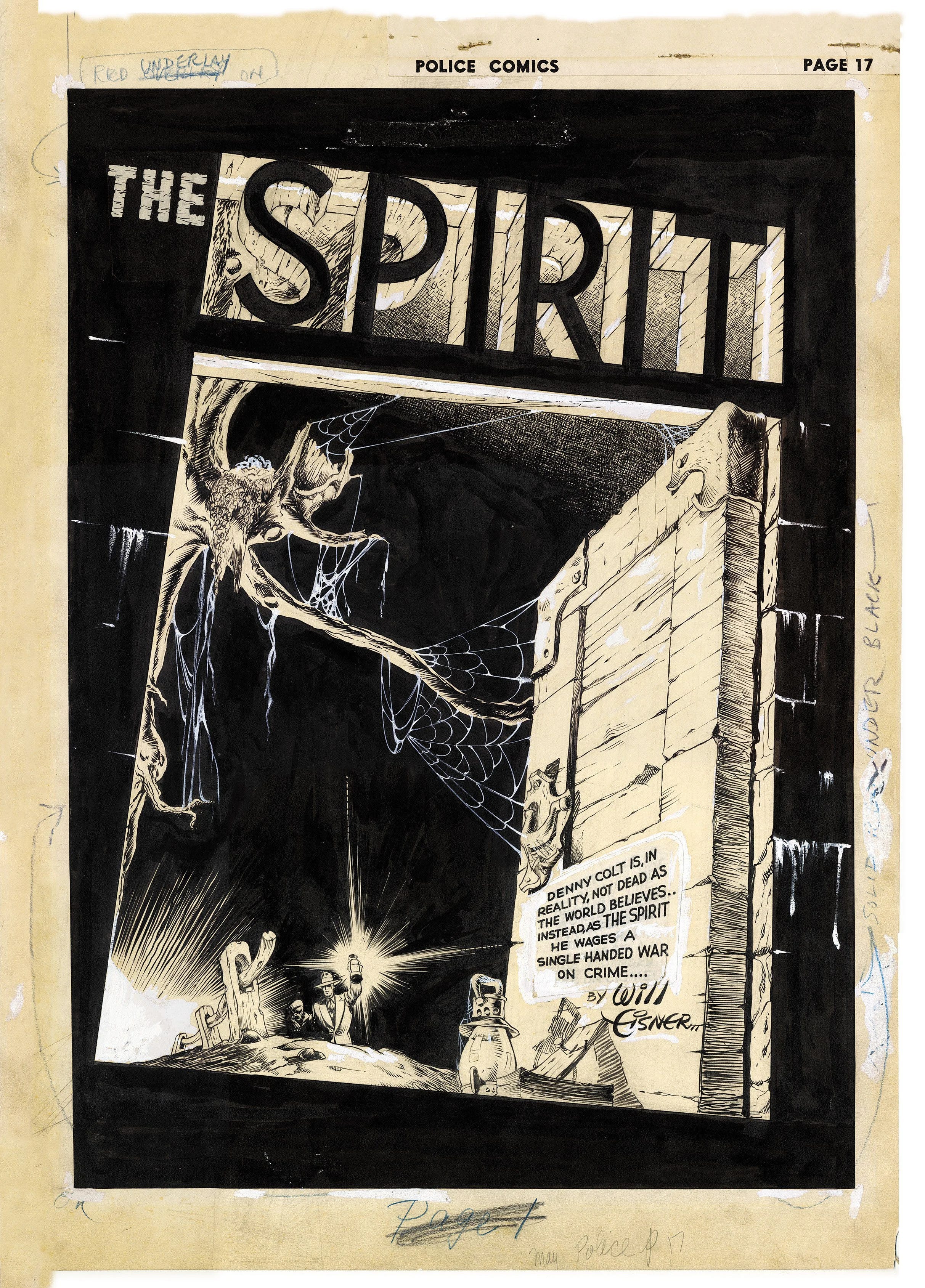
That's why things go in and out of fashion. As long as the storytelling is clear and exciting and challenges the reader into wanting more, then we're doing our job. Who knows...maybe Eisner's style will come back around again and become more acceptable, but in a new and innovative way.
With lush effects like these, one can surely hope.
=s=