

WEAPONIZED PORTFOLIOS
How to be Your Own ART DIRECTOR

This is how to develop a sound presentation for your next job, whether you're a freelancer or a salary person, a concept artist or a designer. These universal tips will help put your work in the best light.
The landscape of job searches has changed immensely from the days of answering WANT ADS in the local newspaper. The last time I did that, it was the very start of my video game career, back in 1994!
Now, with the advent of LINKEDIN, Headhunters, Consulting firms, and other job brokers a new business sector has emerged where there used to be no middleman. My cousin actually runs a business for high-tech job placement and does very well at it, too. She generally gets a percentage or in some cases a flat rate for finding the right candidates for the job (paid for by the companies in need, not by the potential candidate). But unlike most jobs, being a creative is more than just a pretty resume with some experience.
Let's start at the beginning:
EXPERIENCE vs. EDUCATION
How important is education and training?
Depends on many factors.
Prefer a downloadable PDF? Get it here.
If you're a lousy artist with great education, it means you're a lousy artist with bills. If you're a great self-taught artist, your chances of getting a job are better. Ultimately if you're a great artist with a great education, you'll be able to pay off those bills quicker than the first person.
But as a self-taught artist do you know the proper way to model a character for a MMORPG vs. a FIGHTING GAME?
Maybe. Maybe not.
Would you have learned how game development pipelines work in a school vs. having had the experience in a studio?
Again, maybe or maybe not.
When I started, the industry was young. It was in a new phase, beyond 8-bit Atari games or the more robust arcade games. We were working in 3D and many of us who could draw well, were paid to learn on the job. Think about where VR and AR game development is today and you'll sort of get the picture. (It's unlikely ANY COMPANY would pay to have someone learn on the job these days. Especially those who didn't have SOME experience in a related discipline). Things have become more specialized ad infinitum.
Just being a great 3D Modeler or Concept Artist isn't enough. A GENERALIST is more or less what you'll be upon graduation from school, because you're learning ALL THE TOOLS. But once you graduate, you'll have to pick a lane and forge ahead. Unfortunately, because of the GLOBAL COMPETITION, it's imperative to start one's education early. Hence, to a large degree, we all need to be self-taught to even keep pace with the world. And it never stops.
I have a nephew who believes he wants to be an artist. He's got some natural chops and has shown some real ability to develop his skill. I encourage him to watch as many free videos as he can, and not just mine. But alas, kids will find their own way despite my willingness to help. It certainly has me wondering what will happen in his future.
I worked hard and was very disciplined from an early age. But even that wasn't enough 40+ years later. It goes back to the actor's edict that you must keep your instrument in tune. Invest in yourself over and over again. Learning on your own is great but learning from others and with others every decade or so is probably a good practice to keep your career in check. Every time I've done it, there has always been an upside. Luckily, I found great teachers; not always, but mostly. Even in the ones who were just mediocre, I still found something of value.
THE RESUME
Resume writing is a good skill to hone and study. The rule of thumb used to be keep it all on one page. HR and hiring agents have no time to rifle through your multi-page career auto-biographical epic. But the thing is, people are changing jobs more than they used to. So people may have to start lopping off the tails of past employment to cinch things up. Some timeless tenets still apply: GET TO THE POINT, QUICKLY.
Below I'll cover the basics of a sharp resume. Outside of you NAME & CONTACT INFO state up-front what your OBJECTIVE is, so that it's clear not only to you but potential employers. Which simply put is: What kind of job are you looking for and what do you have to offer? All this should be contained in one sentence. Think of it as an elevator pitch/ask.
I want to leverage my ten years of character design to help develop the AAA next gen game for a groundbreaking studio.
From there it's a laundry list of your career.
Dates of work- ex.11.2012-05.2015 the month and year should be plenty
Company Name- XYZ Creative
Location- Springfield, IL- This is important because some studios have multiple locations and sometimes those locations have specific disciplines.
Position- Make sure your JOB TITLE is clear and easy to read.
Duties- This should be very succinct. i.e. Concept Artist, Illustrator, Marketing Illustrator. i.e. Created concepts for XDX Mobile Game for the Playstation 5.
Projects/Titles- This is a great help, especially if it's reached the marketplace. Avoid putting stuff that has gotten cancelled. If that were the case...my resume would be 1000% longer.
Special- Highlight any awards, innovations, or achievements if applicable. I know some people who have patents that were developed while working on various projects. It's worth celebrating your achievements.
RINSE & REPEAT- If you've had a storied career, pick those jobs that are specific to the job that you're going after. You don't have to list every job, from working at the Mall to Leading a team of 10 animators on a tent-pole movie for Warner Bros. If you were an ART LEAD for instance but say you were a CONCEPT ARTIST before that...but the job listing you're applying for is for a CONCEPT ARTIST, then, highlight that part of the job for XYZ company. You can mention Art Lead but make sure the critical items highlight your desire to be a concept artist. Especially if you didn't like being an Art Lead or you're hoping to get onto a larger team. Imagine being an Art Lead on a Mobile Game and thinking you're equal to an Art Lead on a game like Halo. It's not a 1-to-1 ratio. Just do your best to be as truthful as possible. Sure...there's going to be a lot of polish that highlights certain things, and there might be things you don't focus on, but just keep it in check and ask friends for their opinion. This will help pressure-test and call B.S. on you if need be. It will also bring up any questions about items that are unclear.
FREELANCE- If you've done some freelance and need to fill out your resume, mention some top clients/contracted jobs to really show that people take you seriously and that you have skills desired outside of your usual 9-5.
SOFTWARE EXPERIENCE- List what you know and what version and even skill level if necessary. i.e. Beginner, Intermediate, Expert...or even Some Working Knowledge.
EDUCATION- From college (years attended & degree earned), as well as further education and any week-long painting/drawing/modeling intensives, etc. All education, while not always a main focus for employers, it does show your desire to stay current and challenged.
WEBSITES/ETC.- This should contain updated links to the most recent work that shows you and your skills in the very best light. If you're spouting politics on Twitter, leave it out! Employers are very sensitive to outliers with strong opinions. And believe me, if they have the resources, they will check your online presence. Likewise, if you're Instagram account has better work than your website, get that website updated!
REFERENCES- This used to be a very important thing back in the day. I used to end my resume with REFERENCES AVAILABLE UPON REQUEST. But being a hiring manager at one point in my career, I realized HR NEVER FOLLOWED UP on such things, despite my pleading. This one is a mixed bag and here's why. 9 times out of 10 nobody is going to say anything bad about anybody. The workforce is a small community and people talk. Your manager yesterday, may be your employee later. So... everyone PLAYS IT SAFE. Nobody wants to be responsible for another person not making a living. BUT...if someone is truly a foul player, then in all likelihood word will get around. So be excellent and be kind.
THE PORTFOLIO
Alright, now to the point of this missive.
Unfortunately, when I graduated from the Art Institute of Pittsburgh my portfolio was as distracted and far-reaching as I am today. Well almost. To be fair, I'm more focused nowadays but still, I could always do better for myself. When you're in your early 20s you're HUNGRY (or at least should be) to try new things, to try anything and to, in some cases, just get a J.O.B. When you're staring down the barrel of those school loans the latter tends to be one’s default. Me, I truly wanted to try whatever and just start piling on to my resume. Which, to give you some perspective, if I were to add all the art jobs I've had since I graduated in 1990, regardless of relevance, my resume would be about three to four pages. It really is useless and amateur to show that level of detail to anyone. That's why it's important to curate the story of your career.
Still, there are some tried and true approaches to creating a strong and focused portfolio of work. Start with asking yourself some of the BIG QUESTIONS:
What do I want to do for a living?
What is the job I'm applying for?
Who is it that I want to work for?
These may be some of the hardest questions you answer for yourself. Even at the point in my career now, I still have a problem with these questions. BUT I know I have to answer them if I'm to be taken seriously as a professional. I also have to answer them when I choose what I need to put in my portfolio to attract specific types of clients. That's why at some point I ended up with two websites. There was just too much stuff and it overwhelmed Art Directors.
FENCE POST CONCEPT
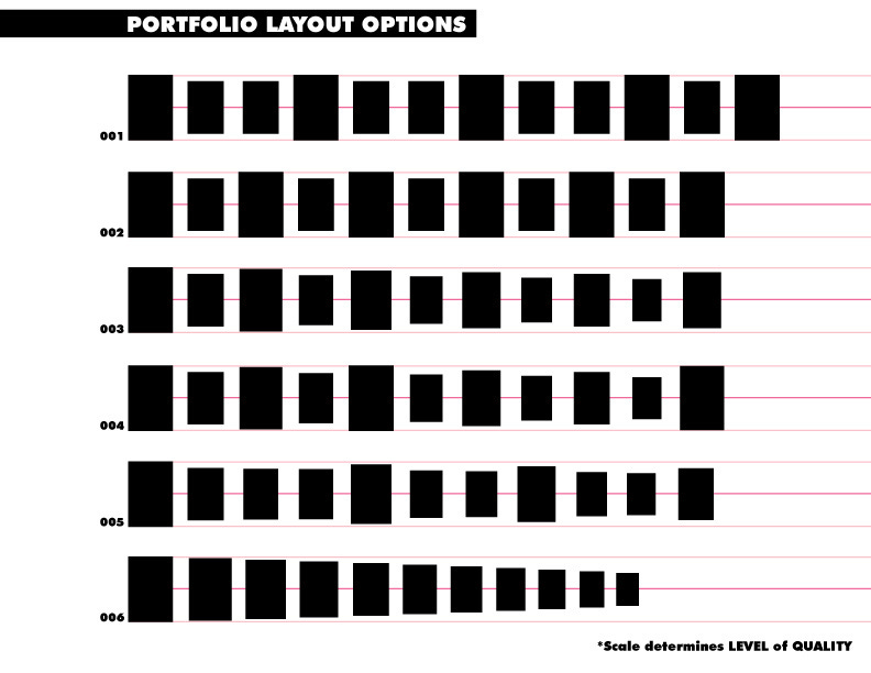
There's a thing called Fence-posting that was more prevalent when people used to review physical portfolios. It constituted a rhythm of laying out one's portfolio so that stronger and weaker images were balanced throughout with each page turn.
I'll move through several scenarios that will give you an idea of the different approaches that you may want to try whether you're showing a portfolio or sketchbook.
Generally, 10-12 images constitute a reasonable portfolio. Short and sweet.
001

Based on the above image if SCALE determines LEVEL OF QUALITY, then it would suggest that the first block is as strong as the last block and all the intermediate blocks of similar size are of equal quality.
It's nice if you can get to this level, but it does have it's challenges. It just determines how prolific you are and where you're at in your career. More established pros can probably show a portfolio of this quality. For many of us, it's aspirational.
002

Again, this is another aspirational portfolio. If you think of the larger blocks as heavy-hitting top-quality images...it's like you're going at this hard. You're delivering knock-out after knock-out. No easy task, but great if you can do it.
At least the one before it creates moments of rest before each heavy hitter. Pacing is a good thing in some cases. This portfolio layout might be good if you don't have a lot of time with a client or AD and you're a top-notch artist.
003

Now...this is a bit more realistic. Start off with your STRONGEST IMAGE and oscillate in a descending order of quality, with a fence post every other moment. I think this one is probably good for website presentation where people don't have a lot of time. It's a nice balance and in all likely hood will keep people clicking through.
004

The only variation here is that you last image is as strong as your first image. This is a good portfolio if you're controlling the pacing--say if you're flipping through this in an interview. Better yet, if you make that last image more iconic with a strong silhouette and strong color it'll have a lasting impression, since in all likelihood, it'll be on the screen longer.
005

The quality of these images drop exponentially. But as you can see the spacing is greater, maybe a little more leisurely. As you get toward the end the pacing changes a little as well. This too would work if you have a reasonable amount of time to show your work.
006

This is a bit of a dive bomber. If you are COMPLETELY RUSHED, like at a convention or something where people are going to interrupt whoever you're showing the work, too, there's a chance they'll never make it to the end. So, front load your best work in descending order and HECK WITH THE FENCE POSTS! :)
Granted, these are just the basics of laying out both a physical portfolio and a digital portfolio. When applying for a gig find a way to give the client/employer access to a curated part of your website if you can't physically be in the room. That way you can control the content while they control the pacing of it.
If you're meeting in person, in many cases you're presenting a digital folio in a conference room off of your laptop or iPad. I can't tell you how terrible I feel for people who's EQUIPMENT INSISTED ON UPDATES while they were trying to show their PORTFOLIO. In one case, a potential employee could not get past it and we were unable to view his work. A complete waste of everyone's time. So take care of all that beforehand.
Rarely do you get a chance to show physical work...BUT...give it a shot. Maybe it's a supplement to the digital portfolio. Physical artwork has a way of eliciting a physical response from people--especially if it's really good. Whether it's a sketchbook that you might show to get hired as a concept artist or a series of large paintings and illustrations, if it's consistent with the digital portfolio then it also shows a mastery that goes beyond any other candidate that they'll hire. They even may start to ask questions like: "How'd you get that highlight?" or "What paint did you use?"
You'll be the envy of other creatives in the room and be equally inspiring. If it's good, show the goods.
PRESENTATION
While we talked a little bit about presentation in the paragraphs before, one thing that's worth pointing out is this: Avoid repeating what you've shown on your website. If you've submitted a website the team will have already seen your work. To show it again may get a few people asking questions but ultimately will plunge the room into a weird silence. It also depends on the type of job you're applying for, too. The more complex portfolios like animation, high-poly modeling may have a lot of technical and follow-up questions. Do your best though to intersperse with NEW THINGS the client/employer have not seen.
I know this part is hard. The submitting phase is about getting in the room and having a conversation. It's about sharing who you are, what you know and how you answer questions and describe your work experience.
One MISTAKE that people have made that basically ends the conversation is showing work that is covered by an NDA (non-disclosure agreement). It's like a cheating partner. If the person you're dating is cheating on their partner, they'll most likely do the same to you. Just don't do it. It's bad form.
Sharing personal projects that are not on your websites is much better. The reason is two-fold; if its in development there's still some excitement around it for you. It'll also show what your thinking process is as well as what it looks like when you're not boxed in by a project. There is typically more energy around this part of the presentation for all parties involved...so, you might want to show that toward the end. Just make sure it's appropriate to the client/employer at hand.
CURATING THE WORK
This can be easy, or it can be hard. A lot depends on where you are in your career. If you're starting out you're trying to be the right person for the right job. You're CHASING THE DREAM. That might look like you're constantly updating your portfolio with company relevant work because you NEED A JOB.
It also might mean you want a shift in your career. Maybe you're tired being a packaging designer but instead would like to do more marketing and promotional material.
Imagine being an editor for Marvel and all the portfolio you see are DC comics characters, or characters nobody has even heard of. Editors and Art Directors can be literal at times. If they DON'T SEE IT in your portfolio, THEY DON'T THINK YOU CAN DO THE WORK. It's galling, I know, but you have to do your best to cover all your bases and stay focused at the same time. If it sounds impossible, you're probably right. That's why it's important to know what you want ahead of time.
PORTFOLIO WALL
I started using the PORTFOLIO WALL in art school as I was running through assignments and freelance at an alarming speed. I knew at the end of the program I would need to submit a graduation portfolio. But for me to see the big picture I needed to have the work in front of me. Back then, as I do today in some cases I actually used a physical wall, whether it's for originals or digital printouts.
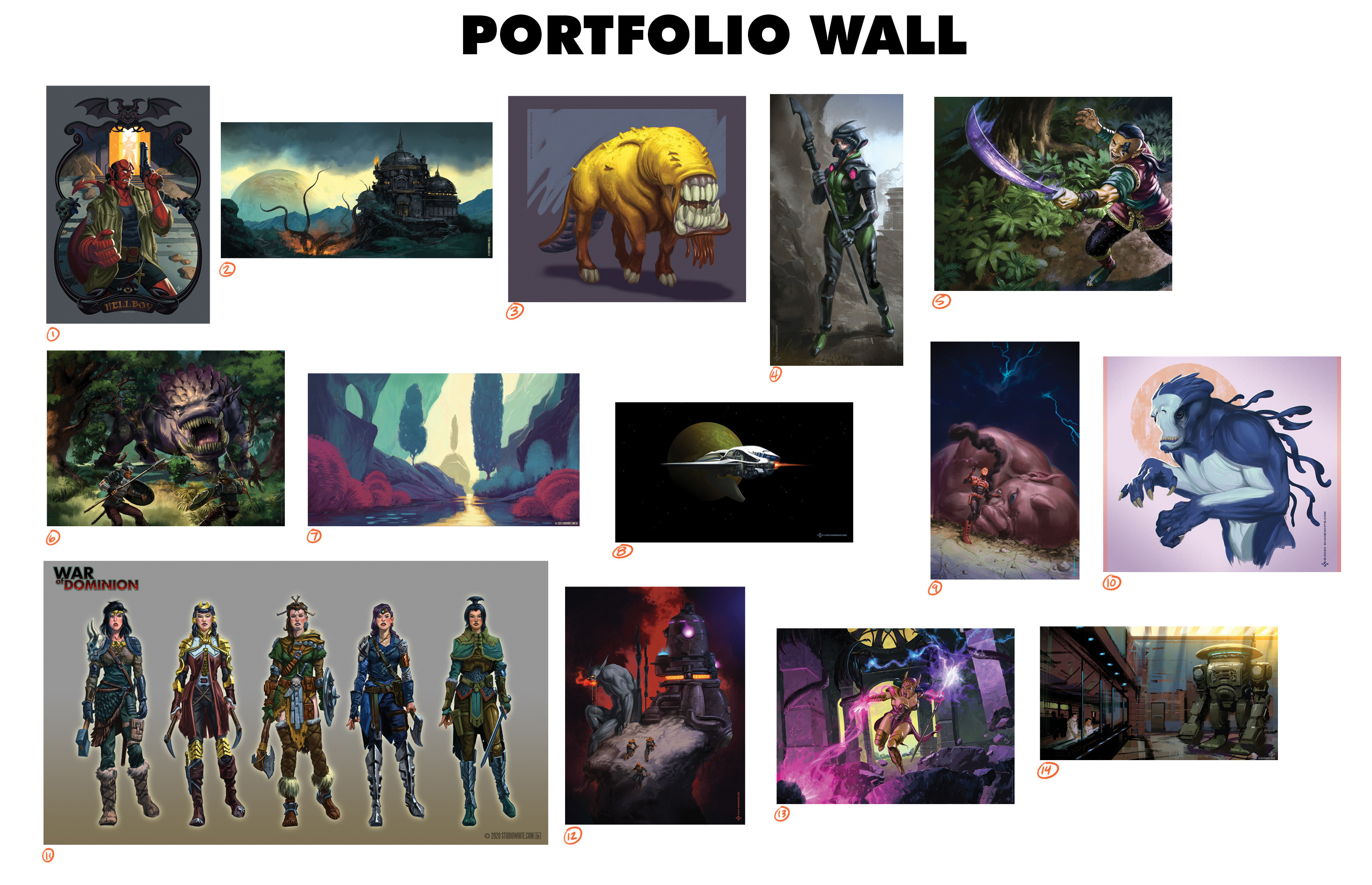
Years later...I still do this. Before places like ART STATION and CG SOCIETY, I used to make a Desktop Image with the latest images I created. That way I could see where I was, at a glance. So...like the image from the introduction of this post this is what it would look like.
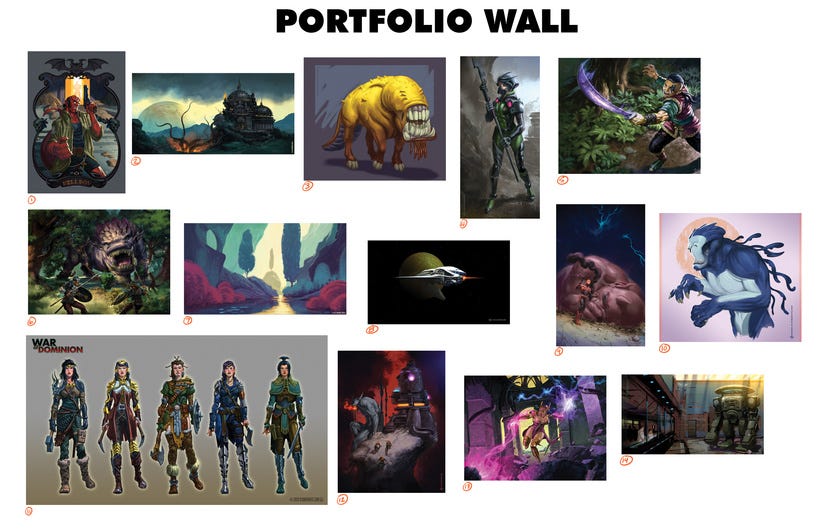
Seeing elements all together, it quickly gives you a sense of "one of these things is not like the others". And soon, it becomes apparent which pieces should be nixed to get within that 10-12 image sweet spot. That being said here's how I'd assess my "Concept Art" portfolio so far.
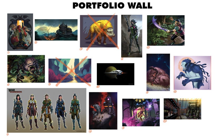
01-Shows some design elements...while no other piece does. It may need to get booted or I may need to add another if I feel strongly about exploring design elements.
02-Very flat. While there's some interesting things going on here, it lacks depth and some focus, even if the silhouettes are somewhat strong. This may be one of the first to go.
03-GONE- a cartoonish creature that does not fit in with the rest of the portfolio.
04-As a character design it's week and could use a bit more exploratory sketches to accompany the picture to pull it out of the "uninspired illustration" category and seat it more into the "concept art" category. Right now it's a bit too polished for something lacks a "wow" factor.
05- Fair and balanced render of a somewhat pedestrian image. It's a fine use of pushing racial bounds, it gets some points for that, but what is the image really saying? Where's the story?
06- A decent illustration per se. Good story elements and fine palette. The execution is a little mixed and the creature-redesign of the "Hunted Wumpus" does not instill shock and awe.
07- GONE. Compared to the rest of the portfolio this feels more like Animation Previs and there is very little of that in the rest of the set of images.
08- Because of the amount of space around the ship, this feels like it could have been more of an illustration or on the road to being a piece of key art. I almost nixed this as it wasn't completely fitting in. I need to decide what kind of portfolio this is and whether or not to push this in a more specific direction...or add another accompanying image of the same ilk and flavor.
09- Decently rendered piece of key art. Uninspired creature design that could stand a revisit. Perhaps a bit more "set and setting" could be included.
10- Nicely rendered creature design. Somewhat interesting but there's not a lot to go on if it's a piece of concept work. Maybe some accompanying sketches or callouts would help.
11- Decent lineup of costume and character concepts. Execution is consistent, but nothing really stands out. Does not inspire as much as I would like it to.
12- This would have been killed if there wasn't another demon piece already in their to give it some relevancy to the overall portfolio. The machine poorly design and misrepresents my draftsmanship. The overall "key art" that is strives to be lacks depth and could have stood a few more rounds of concepting.
13- A fully realized illustration that generally works and plays well with the other two similar illustrations of equal rendering quality. The character design feels a bit generic and a little heavy-handed at the same time.
14- Decent speedpainting...though it would have been nice to see two more underneath it to illustrate other speedpaintings as a "technique" that can be called upon time and again for quick ideation.
As far as FENCE POSTING, the following images in order of quality are what I'd use as my Fence Post as this portfolio currently stands:
13- Strong image, bold color
06- Action with creature design and story
09- The contrasting scale of figures works well enough to put a story over
10- Strong silhouette shape, decent rendering
05- Not my strongest piece but it creates a third tier of an equal quality render
01-Because it's recognizable, iconic and red. (people remember things that are red)
Worth noting, if you haven't picked it up in my above assessment:
Balance is important, whether it's with theme, technique or execution.
2-3 images of similar theme, technique or execution will help with balance.
Understand the job you're trying to get and what your work says about where you're at in the process. I called this my "Concept Art" portfolio. Imagine if I'd called it my "Illustration Portfolio" how would that have changed my assessment?
While it may be hard to give myself "praise" and the language above seems at times callous, exercising an objective view of your work is important. Practicing a certain level of detachment has value in not being too precious.
Here are some questions to ask yourself to help create objectivity:
Does this person know what they're doing?
What are the greatest strengths?
What are the greatest weaknesses?
What are they the most consistent at?
Does any of the work inspire or cause a sense of wonder or awe?
Of all the questions you can ask yourself of your own portfolio it's this: Would I give this person a living wage to execute the same quality of work for the next year?
ON THAT NOTE
A portfolio is kind of like a living document. As you produce work you get better and can replace the weakest of the weak. Try to create something at least once a month that knocks any of the previous pieces out of the running. Give yourself theme challenges, technique challenges or other things that address YOUR WEAKNESSES. This is the only way you have a chance of getting better outside of learning on your own.
Also, if you produce a lot of different work fits under several categories like animation or concept art for video games for example then consider consolidating those images into their own portfolios. Creating separate branches on your website of 10-12 images so that it doesn't feel like a jumbled mess to potential clients should help. You'll also be able to share specific links based on the jobs you're going after.
Hopefully this helps you in weaponizing your portfolios and getting yourself on track. Good luck in the new year.
To quote my painting teacher, Henry Stinson: "Start strong, finish strong!
=s=